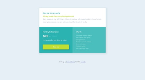
Single price grid component solution

Solution retrospective
I'm not sure if the page looks fine in a 800px width screen, so I would like feedback on that.
I've come across problems I'm not sure if I've solved in the best way. I had trouble making the box shadow for the container because the shadow would start from the padding, I solved that by creating a new div tag to add the box shadow to.
I also had trouble making the "monthly subscription" and "why us" elements align horizontally for the desktop design, as "why us" looked shorter. I adjusted the padding, font size, spacing and weight until they aligned, but then I noticed they would only be aligned in my desktop's full window. I fixed that by adding a background color to the same div I had used for the box shadow.
Please let me know if there were easier or more efficient solutions for these problems.
Please log in to post a comment
Log in with GitHubCommunity feedback
- @KayloPortal
🎊Hello, Nice job!
🎄 I saw your project and your code, good job, and nice problem solving!
🔮 I have some suggestions for your code that can level up your code.
- Responsive Layout Sizing
- As you said, the layout has a problem, when we get into 800px width, the points lose their positions. This problem happens because of the sizing method that used to sizing the .countainer and .countainer2
.container{ margin: auto; width: 100%; padding: 80px 30px; }-
The container width is set to 100%. it means that the box is looking at it's parent to set its size. the parent here is the <body> tag. 100% of width for body tag children, equals to the maximum width of the device screen size. (for example if the screen width is 800px, the 100% width for <body> children like [.container] equals to 800px)
-
Also, we leaved a padding for the .container, Right? The padding value is 80 & 30. it means that the width of the container2 is equal to (100% of the width - 30px - 30px). Can you see the problem here? let me ask a question,
-
What's the value of the .container2 width, in a mobile with screen width of 350px?
-
it equals to 350 - 30 - 30 = 290px.
-
What about a tablet with 1024px screen width?
-
1024 - 60 = 960px
-
The width is not a fixed value, it's changing on different screen widths. So, What problems can it make?
-
using vw and screen widths for sizing our boxes have a big problem, we have devices with screen size of 200px to 4650px and higher, so if we set our elements sizes by these sizes, it will change and change and change on lower or higher screen sizes, and many times this changing value is so bigger that we wanted. For example it's very small on a mobile as we can't read them, and it's very big on a TV or a 4K monitor.
So, what's the key?
-
CSS have "rem" & "em" units for creating responsive layouts. instead of using vw for sizing our boxes or making them with base of screen width with using 100% value in <body> tag, we can use rem.
-
rem is a relative unit, and the base and value of it can be changed with CSS or devices. you can read about rem units here and here and here
And, also, for using h1-h6 tags
- NEVER USE <h1-h6> TAGS BY THEIR SIZE
- The reason of we have 6 tags for titles, is not the size. it can change by CSS.
- The reason is S.E.O and accessibility. you can read about accessibility here
Marked as helpful

Join our Discord community
Join thousands of Frontend Mentor community members taking the challenges, sharing resources, helping each other, and chatting about all things front-end!
Join our Discord