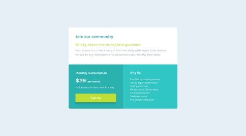
Single price grid component solution without media queries

Solution retrospective
I've used viewport units (vw) for the font size in some elements. Are there any drawbacks to this? The zooming seems to work fine.
Please log in to post a comment
Log in with GitHubCommunity feedback
- @dgdev1024
Viewport widths and viewport heights (vw & vh) are dependent on the size of your viewport - your screen. If that size is too big or too small, there's the possibility that the element using those will not appear correctly. If you are setting VWs and VHs for your element's size, I would advise also setting fixed 'min-width'/'min-height' and 'max-width'/'max-height' properties in order to alleviate that issue.
Your bottom two panes don't seem to appear correctly on devices larger in screen size than a smartphone and smaller than a large desktop. Consider using a CSS Grid layout for your panes. You can use that with media queries to place your panes in such a way that they appear correctly, regardless of the viewport's size. You can learn more about CSS Grid here: https://css-tricks.com/snippets/css/complete-guide-grid/
You're doing good, though. Good luck and keep it up!

Join our Discord community
Join thousands of Frontend Mentor community members taking the challenges, sharing resources, helping each other, and chatting about all things front-end!
Join our Discord