Submitted almost 2 years agoA solution to the Single price grid component challenge
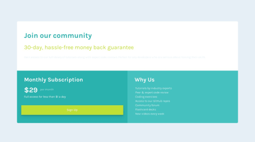
Single Price Grid Component using Bootstrap
bootstrap

P
@blordeus
Code
Please log in to post a comment
Log in with GitHubCommunity feedback
- @bccpadge
Hello @blordeus. Congratulations on completing this challenge!!!🎉
I have few suggestions to improve your solution.
- On desktop your media query below makes your component stretch
@media (min-width: 1200px) .container, .container-lg, .container-md, .container-sm, .container-xl { max-width: 1140px; }- To fix this issue you can remove the code below
@media (min-width: 768px)
.my-md-4 {
    /* margin-top: 1.5rem!important; */
    /* margin-bottom: 1.5rem!important; */
}
.py-5 {
    /* padding-top: 3rem!important; */
    /* padding-bottom: 3rem!important; */
}
.px-5 {
    /* padding-right: 3rem!important; */
    /* padding-left: 3rem!important; */
}
/* This was your media query at 1200px and switched to 1024px and changed the max-width  to be smaller. This makes your component look similar to the design image */
@media (min-width: 1024px)
.container, .container-lg, .container-md, .container-sm, .container-xl {
    /* max-width: 800px; */
}
@media (min-width: 992px)
.container, .container-lg, .container-md, .container-sm {
    /* max-width: 960px; */
}
Here is my take on this challenge using HTML and Tailwind CSS: Single price grid component
Hope this helps you and don't hesitate to reach out to me if you have any questions
Marked as helpful - @iamdylanmj
it seems like you are on the right path, I did same when I first start, but I focused more to learn how CSS media query works, specially how min-width & max-width behave within CSS media query. I suggest you to pay more attention to learn those little but important aspects of responsive design. good luck.


Join our Discord community
Join thousands of Frontend Mentor community members taking the challenges, sharing resources, helping each other, and chatting about all things front-end!
Join our Discord