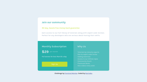
Single price grid component using html and css

Solution retrospective
This is another project from a front-end mentor I have completed and I will appreciate the valuable feedback from the community.
Please log in to post a comment
Log in with GitHubCommunity feedback
- P@dwhenson
Hey, @socoolRK nice work here - here are a few suggestions you might like to consider:
- I'm not sure why you would add
min-height150vh to thebody? It adds a lot of unnecessary scrolling to the page. I would suggest just addingmax-height:100vh. - If you do the above and want to center things, in this case, I would suggest wrapping all the content in a
divor maybe asectionand then using display grid or flex on the body to put this new only child element in the center of the page - this is pretty handy for quite a few FEM challenges so it's worth finding an approach that works for you (I tend to use:display:grid; place-items:center;. - Just a note on the use of headings... We shouldn’t use headings to make text look BIG or bold. Use them only to set out your document's heading and show the document structure, and then change things up with CSS after that. This is important as many people using assistive tech to access your pages will navigate the site based on the heading structure. At the moment this wouldn’t work with your HTML.
In this case, for example, you have an
h2followed byh4(which probably shouldn't really be a heading but just apwith some styling). Most people suggest that there should only be oneh1per page so your firsth2might be better as anh1in this case. I approach this by first laying out the page using only HTML and only thinking about the document structure, not design at all, and then once done, I return to the page and use CSS to make things look how they should.Again, this will come up over and over again in FEM challenges so it's worth getting an approach to this that works for you down that you can apply in other challenges too.
But, the component looks great! And nice job using the
ulfor the list - a lot of people miss this! Keep up the good work.Cheers Dave
- I'm not sure why you would add
- @FluffyKas
Hey there,
There's a few issues here, the biggest being the way you achieved the layout. You'd need to use either flexbox or grid for this, instead of individually positioning each element with
position: relative. I could go into detail with the accessibility issues and other smaller things but it feels like you're missing some core concepts.I'd recommend checking out Kevin Powell's channel if you haven't already done this. He has a great beginner course on HTML and CSS. It's a few years old, but for learning the core concepts it's still an excellent source!


Join our Discord community
Join thousands of Frontend Mentor community members taking the challenges, sharing resources, helping each other, and chatting about all things front-end!
Join our Discord