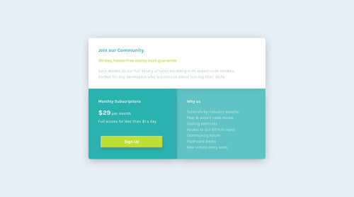
Single Price Grid Component using Sass & Grid

Solution retrospective
I didn't have the design sketch so matched the styles & measurements as best I could. I struggled with making the project mobile-first and adapting the code for larger screens - so I'd be keen to have feedback on the media queries - do they look a bit hacky? I'd also like feedback on making my CSS cleaner in general.
Please log in to post a comment
Log in with GitHubCommunity feedback
- @monodonBrand
Hey. My only suggestions for you for this task is to use pixelperfect extension for your browser so you can really be accurate in sizes and spacing.
I would not use utility classes in a project of this scope, they add duplication if you are already using variables.
And finally use some kind of a reset.css file to change browser default styles (such as list styles), and that will add clarity to your code.
- @GerbenDol
Cool to see you use utility classes on here - great small scale challenge to practice! 😁
There are some things I think you may have over-complicated a bit:
- I feel like centering the
component-containercould've been easier using grid or flexbox, which will give you a bit more flexibility compared to absolutely positioning it. - Set your border radius on the
component-containerand useoverflow: hidden;to stop the inner boxes from overlapping the rounded corner. That will save you writing the specific border radius for each box in your different media-queries.
I think your media queries look just fine! Adding the grid on bigger screens I think is the perfect solution here, so you did really well! 💪🏻
- I feel like centering the
- @primocodetoday
Mobile-first approach. Very nicely.


Join our Discord community
Join thousands of Frontend Mentor community members taking the challenges, sharing resources, helping each other, and chatting about all things front-end!
Join our Discord