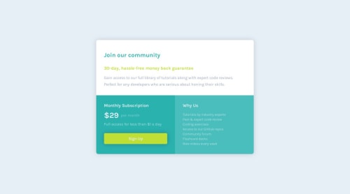
Submitted almost 5 years agoA solution to the Single price grid component challenge
Single price grid component with CSS Grid and Flexbox.

@JALCH-1512
Solution retrospective
I think my code is more complex than it should be. I would appreciate any advice to improve it, as I would also like you to tell me what good practices I can implement in my code. :)
Code
Please log in to post a comment
Log in with GitHubCommunity feedback
- @sonickonic
Hey Javier! Nice work the screenshot looks awesome! 😎
Your code looks good overall, I have just a few observations:
- You've currently got multiple
<p>elements, where different HTML elements may be more appropriate.
- The
<p>defines a paragraph. The best use for it will be in the "Join our community" section, instead of the<div>. - In the "Why Us" section, instead of using
<p>twice, a<h2>for the heading and<ul>for the list of features will suit better for semantic and accessibility
- CSS reset will set the whole page to 0, for a fresh clean start, instead of setting
margin:0;to a specific element.
* { margin:0; padding:0; }Have you tried a Mobile-first approach? It's quite a common workflow, you starting with the mobile version and switch to
min-widthmedia queries instead ofmax-width. It helps to simplify the CSS code) - You've currently got multiple

Join our Discord community
Join thousands of Frontend Mentor community members taking the challenges, sharing resources, helping each other, and chatting about all things front-end!
Join our Discord