Frontendmentor Responsive Portfolio Website (Premium Challenge)

Solution retrospective
The following are the problems which I faced while building out this website (also listed in the readme.md file):
-
Disorganised CSS:The whole process of building this website was filled with lots and lots of problems. And the end-result might look somewhat okay but there are many problems which could have been overcome if I had a better plan to tackle them early on.
-
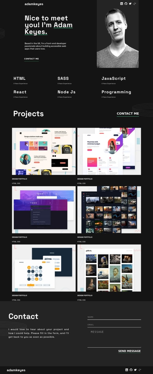
Problems caused by focusing on section too much: When I first started out building this project, the grid that lays out the hero-section was behaving very weird. I was so caught up in solving these hero-section grid problems that I did not plan the css-variables well from the figma file. This might have led to problems in typography. And this might have caused the "Adam Keyes two appear in two lines instead of one(as given in the figma file)."
-
Unpredictable layout problems:My layout had so many problems due to which I had to manually set margins and paddings for different media queries. This was so hard that it sucked my joy out of the process. I think I need different classes like section and container to align things properly. I definitely need help on that. This somewhat got okay when I applied justify-content:space-between in the skills section. But it was just out of trial and error. Layout felt very mysterious and very difficult.
-
Too much repetitve code :I never used the DRY principle. I have repeated myself over and over again. It was all brute-force. It could have been much more elegant and smooth. I need help on that also. I need to learn how to write reusable classes. For example : the green underline should come from .underline styles defined in style.css only at one place.
-
Changing styles manually caused lots of problems in other sections:By the time I felt like I might eventually mess the whole layout, I impatiently wrote the css for skills section and projects section. This led to more trouble cause there was lots of unorganised code in my style.css. Because I know Kevin Powell's youtube channel, and I have seen him organise things in a very clean manner I thought it's a good idea to do things the brute force way and submit it on Frontend Mentor and then get feedback on my mistakes. I am aware of some of the mistakes and I know there are many more that I am not aware of.
-
Form validation: The Contact Form's Javascript is little bit taken from MDN and somewhat customized to meet the project requirements. But there must be a better way to handle errors. I still was not able to get the warning icon in the input box. Also, the email validation does not work as expected. Tweaking the MDN code in my app.js did not follow clean code standards. It could have been much elegant.
-
The Contact Form's grid layout was messed up because I had disorganised padding and margin(I am just guessing).
-
Over using !important: This happened all the time. It somehow worked while I was doing media queries. But I think so much !important is not necessary.
-
In many places I felt like I am rushing to make a submit on Frontend Mentor. This might have caused lots of wrong decisions while writing CSS.
-
overlay effect: The links that appear on hovering over the project image are very light. I guess I did not understand how opacity works. I took a little bit help from w3schools.com but that did not help me much.
-
Problematic typography font-sizes: I did not touch the font-sizes much because everytime I changed a font at one place, my layout was breaking and getting messed up.
-
Different classes for displaying different size hero-image: I had to write four different media queries for showing and hiding hero images. I could have used srcset just like Jessica Chan from Coder Coder did.
-
Inconsistent border bottom in form validation: I had already spent 1 hour on form validation and setting border-bottom color on empty-field, valid and invalid inputs. Something was not working right so I had to revert back to this current version. Like I said, form validation could have been way more better. I really need a standard set of steps to implement form validation in a much more predictable way.
-
Problems I might have missed: I am a beginner. I might have missed lots of problems. I would love to hear about them and how they can be fixed. After deploying on netlify, there might still be some layout issues.
-
I will obviously implement the feedback in the next project. But for this project, should I refactor my present code? I am kind of burnt out doing this project for the last five days and I feel like I should start a new project I think like I am obsessing too much. Should I start a new project? Please guide me on how to keep moving and having fun along the way.
Please log in to post a comment
Log in with GitHubCommunity feedback
No feedback yet. Be the first to give feedback on Manish Panda’s solution.
Join our Discord community
Join thousands of Frontend Mentor community members taking the challenges, sharing resources, helping each other, and chatting about all things front-end!
Join our Discord