Skilled e-learning landing page

Solution retrospective
I'm really happy with how this integration turned out, especially with achieving responsiveness in a clean way, I always have fun working with grids and cards.
The only thing I might reconsider is the header image; I’m thinking about recreating it entirely with HTML and CSS to practice and further develop my positioning skills.
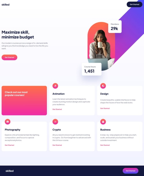
What challenges did you encounter, and how did you overcome them?For me, there were two key challenges in this project.
The first was the header image. I wanted it to be responsive while maintaining a balanced and visually appealing layout. I also needed to extend the blue line so it didn’t get cut off, which involved some work with position: absolute and a lot of tries and tests.
The second challenge was creating the gradient background with hover effects on the buttons. I achieved this by experimenting with pseudo-elements in different ways, ultimately getting the effect I wanted.
What specific areas of your project would you like help with?I would be glad to receive some feedback on the positioning of my header image. I’m sure there’s a more efficient way to achieve the effect I’m going for, so any suggestions or insights would be greatly appreciated!
Please log in to post a comment
Log in with GitHubCommunity feedback
- @Alex-Archer-I
Hey!
This is purely decorative image, so the most convenient way to add it -
background-imageproperty. And you won't have to create those additional elements. I guess this is a png file, so you can usebackground-coloras well. If this picture was important for context of the page you should useimgtag cos it hasaltattribute to tell screen readers about this, but that's not the case here.Marked as helpful

Join our Discord community
Join thousands of Frontend Mentor community members taking the challenges, sharing resources, helping each other, and chatting about all things front-end!
Join our Discord