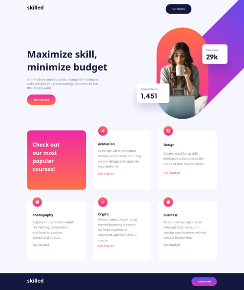
Skilled E-learning Landing Page

Solution retrospective
This project design had me in a twirl. The background image was a hassle! I couldn't get it to work until I used @media queries, but I feel this was a bit messy since my design ended up being very glitchy.
I managed to make it work somewhat, but in the end, I need to find a better approach and/or figure out how to correctly use @media queries with background size and position.
Another mistake I made was not making my text and text containers responsive. I accidentally added px instead of % so that they could size correctly with the viewport.
What challenges did you encounter, and how did you overcome them?Coming into this project, I learned that setting up a background image can be very difficult. I struggled to position the image correctly within all the viewports, which meant not having fluidity when changing throughout all the viewport sizes; instead, it had a glitchy, small-to-big change in size.
I got some good responsiveness after I used the % and vw to get a responsive outcome.
I also made the mistake of not using px instead of % on my .main-header, which created an unresponsive box.
What specific areas of your project would you like help with?If you can give me any advice or tips for a better solution with background-image positioning or another better option instead of the background image, please do. I would appreciate it very much!
Happy coding and blessings to all!
Please log in to post a comment
Log in with GitHubCommunity feedback
No feedback yet. Be the first to give feedback on Rodrigo's solution.
Join our Discord community
Join thousands of Frontend Mentor community members taking the challenges, sharing resources, helping each other, and chatting about all things front-end!
Join our Discord