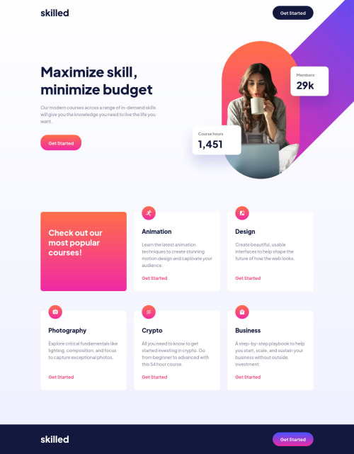
Hi
This is pretty good but there's a few places you could optimise/improve the code I think. I'm quite tired so please forgive if explanations are waffly/unclear! š
- The mobile image goes blurry on some screens because it's been se to be 125% wide and has some odd negative margin on there. I don't think you need either of those things on the smallest screens
- In the header banner and intro you're using a strange combo of margin on the sides... On really large screens the content blows out to the edges so I don't think you want this. Usually you would have a class like
.wrapper
that sets a max-width for content, margin auto on left and right and some padding left and right. You then reuse that class wherever it is needed, on every content wrapper. Like how you've set max-width 70rem on the.cards
, let all content containers be max-width 70rem, margin-left -right auto, padding-left -right 1rem. Then you have consistence and don't have all these bespoke margin values at multiple DOM levels - To force footer to always sit at the bottom of a page, it's quite common to flex-grow main. Not essential, just raising in case you want to do that
- The card grid would be waaaay simpler if done with css grid. All you'd need is something like
grid-template-columns: repeat(auto-fit,minmax(22ch,1fr))
and your grid is done. Of course you'd also need to remove a lot of the complexity you've added to the cards too, like max-width and different paddings on each edge; and you'd need to remove the complex nested margins on the main and card grid.
For example: here are some quick changes I just made to the card grid. Notice how much I'm able to comment out
/* styles.css | https://tarasis.github.io/FrontendMentor/newbie/skilled-elearning-landing-page/css/styles.css */
main {
/* margin-inline: auto; */
flex-grow: 1;
}
.cards {
display: ;
grid-template-columns: repeat(auto-fit,minmax(24ch,1fr));
padding: 1rem;
}
@media screen and (min-width: 48rem) {
.cards {
/* margin-inline: 2.4688rem; */
/* gap: 0.6875rem; */
margin-inline: auto;
gap: 1.5rem;
}
.card {
/* padding-inline: 2rem 1.3125rem; */
}
}
.card {
/* padding-inline: 1.75rem; */
/* max-width: 21.875rem; */
padding: 2rem;
}
.card__getting-started {
/* margin-bottom: 2rem; */
}
Overall, I think you're just making this more complex than it needs to be
Marked as helpful
@tarasis
Posted
@grace-snow Thank you for taking the time to look at it and providing very helpful feedback. I appreciate it <3. I'll make the changes you suggest soon and submit it as an alternative solution.
Good point about using flex-grow
, it would make it look better.
Regards using Grid rather than flex; I do need to mix it more into my usage. After I'm done with the Github User Search challenge, I'm going to tackle the Testimonials grid section as Grid seems perfect for it.
"Overall, I think you're just making this more complex than it needs to be"
Agreed. I am too beholden to the design. I need to find the switch / confidence to just see it as a guide rather than instructions / blueprint. I guess deep down I feel that how close I am to the design is the thing I'm judged against.
Part of the wackiness was born from doing the thing I KNOW I shouldn't do (and acknowledged in the readme). To quote my readme "At each stage I was checking how my build looked compared to the design in Polypane. (I generated images from Figma) I did try a little to get it close to "pixel perfect", which I do know I shouldn't :) As Grace on Slack would note don't try, and shared this article by Josh Comeau.".
So, as a reminder to me:
I MUST NOT TAKE THE DESIGN AS SACROSANCT
@tarasis even with following the design closely, it's the approach you take to that which makes the code complicated. By that I mean, do not treat every element and the spacing around it as bespoke. Try to be more systematic. The key to that is usually slowing down and planning out approach more at the start.