Not Found
Not Found
Not Found
Not Found
Not Found
Not Found
Not Found
Not Found
Not Found
Not Found
Not Found
Not Found
Not Found
Not Found
Not Found
Not Found
Not Found
Not Found
Not Found
Not Found

Submitted

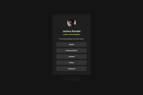
Social Links Profile

P
jasoneczek 280

@jasoneczek

Desktop design screenshot for the Social links profile coding challenge

This is a solution for...

  • HTML
  • CSS
1newbie
View challenge

Design comparison


SolutionDesign

Solution retrospective


What are you most proud of, and what would you do differently next time?

In this project I had the opportunity to use some of the CSS tricks I learned in my previous project, the Blog Preview Card. That is, I used the clamp function again, but this time for responsive sizing rather than responsive text. Using this I was able to (almost) match the card widths at mobile and desktop widths exactly as in the Figma file (more on this in the challenges encountered section below). Additionally, I used a pseudo element for the a tags that are nested in the list items, so that when hovering over the buttons, the user in in fact hovering over the link which triggers the active stylings.

What challenges did you encounter, and how did you overcome them?

While I'm getting responsive sizing of the card width with use of the clamp rather than media queries, at 375px screen width, my card width is about 10px wider than in the Figma file. It's not a huge deal, but the use of the clamp function seems to cancel out any margin to the card, or padding to the body. Playing with the clamp function was the most challenging part in general, but I am happy with it so far. The padding within the card is responding as I would like.

What specific areas of your project would you like help with?

Besides the problem mentioned above, any feedback on accessibility, best practices or any ways to improve in any way are massively appreciated.

Community feedback

P
Grace 27,870

@grace-snow

Posted

This is a really nice solution!

The only issues I see are

  • the attribution is overlapping the content. There really is no good reason to use position fixed on that, it can only cause bugs.
  • the component is touching screen edges at the top and bottom. Add some margin on the component or add some padding on a wrapping element.

Good job though!

0

P
jasoneczek 280

@jasoneczek

Posted

Thank you @grace-snow. I will fix those issues and repost.

0
P
jasoneczek 280

@jasoneczek

Posted

I removed the fixed position on the footer and added 1rem top and bottom margin to the card. I experimented with giving the main element flex grow 1 in order to push the footer down. But then I had to make the main element a flex container as well in order to re-center the card vertically. In the end I thought that was unnecessary coding for something not really important, and the attribute links look fine below the card. In devtools, the height of my card at 375px is 578.82px, and in the Figma file it is 579. At desktop screens my card height maxes out at 610.82, and in Figma it is 611. I'm hoping the margin I added to the card fixes the screen touching issue on shorter screens. For me it is not even close to the edges on my phone screen, but I have a larger phone size.

0
P
Grace 27,870

@grace-snow

Posted

@jasoneczek this looks great, well done!

To test smaller phone height you can always view in landscape mode on a phone.

0
P
jasoneczek 280

@jasoneczek

Posted

@grace-snow thank you for checking my fixes. I appreciate it.

0

Please log in to post a comment

Log in with GitHub
Discord logo

Join our Discord community

Join thousands of Frontend Mentor community members taking the challenges, sharing resources, helping each other, and chatting about all things front-end!

Join our Discord