


I’m afraid you need to rewrite the html in this.
- all content should be contained within landmarks. Every page should at least have a main.
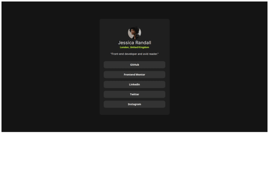
- the html in this is an img, heading, two paragraphs and a list of links. Headings must only be used appropriately. This only has one heading. But even if the design had more headings they would need to be in order. You can’t jump heading levels.
- the img alt is for a description of the image. Read the post in the resources channel on discord about how to write good alt text.
- it is invalid to have anchors and buttons inside each other. They are different elements for totally different purposes. It's very important to use each of them appropriately.
- these links must not open in a new window. If they did, it would be an accessibility requirement to include that in the accessible name. Eg have visually-hidden text that says "(opens in new window)"
- the list of links must be in a list.
- it's better for performance to link fonts in the html head instead of css imports.
There are also some significant issues in the styles
- always use a modern css reset at the start of the styles in every project. Andy Bell or Josh Comeau both have good ones you can look up and use.
- never limit the height of elements that contain text. This component does not need a height. Instead, let the browser do it's job and decide what height is needed based on the content inside. nothing in this challenge should have a height except the image.
- the component must not have a width. Instead give it a max width in rem so that it can shrink narrower if needed (eg on smaller screens) and so the layout scales properly even for those users who change their text size.
- there is no benefit to these flex columns in the component of you're not using the gap property. Block elements woult stack vertically by default.
- line height must never be 0
- font size must never ever be in px. Use rem. I've written a detailed post about this on FEDmentor.dev if you want to understand more.
- the links can be display block and optionally width 100%. They must not have an explicit width in px.
Overall I recommend you try to really simplify the styles in this.
Marked as helpful
1
ashensavi• 30
@ashensavi
Posted
@grace-snow Thank you for the valuable feedback!. I'll keep these things in mind. Thank you for your time.
0
