Responsive Social Link Profile

Solution retrospective
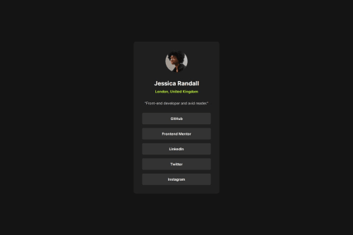
This time, I didn’t have a Figma design to follow—I had to create everything from scratch on my own. I’m proud that, despite that, I was able to design something that looked good on the first try. It showed me how much I’ve grown in both design intuition and frontend implementation. If I had to do it again, I’d spend a little more time planning the layout and user experience before jumping into code, just to make it even more polished.
What challenges did you encounter, and how did you overcome them?One of the main challenges I faced was getting the hover effect on the links to span the full width. At first, I couldn’t figure out why it wasn’t working, even though I’ve struggled with similar issues before. After revisiting the basics, I realized the fix was simple: setting the element to display: block. It was a good reminder that sometimes the solution is just understanding how default display properties affect layout.
What specific areas of your project would you like help with?Since I didn’t have a Figma design for this project, I had to estimate dimensions like card width, height, padding, and spacing on my own. Because of that, I know some parts of the layout might not be perfectly consistent or balanced. I’d really appreciate feedback on the visual spacing and overall layout to help me improve the design aspect.
Please log in to post a comment
Log in with GitHubCommunity feedback
No feedback yet. Be the first to give feedback on noob-sandip’s solution.
Join our Discord community
Join thousands of Frontend Mentor community members taking the challenges, sharing resources, helping each other, and chatting about all things front-end!
Join our Discord