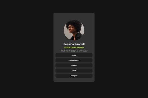
Social Links Profile Challenge

Solution retrospective
I’m most proud of completing the project successfully with all key features implemented and working smoothly, especially under tight deadlines. It was rewarding to see the idea come to life and provide value to users. If I were to do it again, I would spend more time in the planning and design phase to avoid some of the rushed decisions made during development, and I’d focus on better time management and earlier testing to catch issues sooner.
What challenges did you encounter, and how did you overcome them?One of the biggest challenges I faced was handling unexpected technical issues, such as bugs and integration conflicts between different modules. I also struggled at times with managing the workload and meeting deadlines. To overcome these, I broke tasks into smaller, manageable steps, used version control effectively, and actively sought help from team members and online communities. Regular check-ins and testing also helped identify problems early and keep the project on track.
What specific areas of your project would you like help with?I would like help with improving the UI/UX design to make the project more user-friendly and visually polished. Additionally, I’d appreciate guidance on performance optimization, advanced feature implementation, and best practices for testing and debugging to ensure the project is scalable, efficient, and maintainable in the long term.
Please log in to post a comment
Log in with GitHubCommunity feedback
- @mustafasen97
The design is very good. I only have a few suggestions.
First, try reducing the size of the image a little. For example, you can give it a width and height of 90px.
You can also reduce the width of the card a little.
These 2 changes you will make will create a better image.
By the way, you tried to center the design with display: flex; but it was not centered. Then you added margin-top to the .card-body class. Delete the margin-top: 125px; code from the .card-body class.
Then when you go to the body and add min-height: 100vh; your design will be centered vertically as well.
You have added a transition to the buttons, which is a good thing. You may not think of much visual change for such a design. However, as the design grows, it can be more original and you can create more stylish images with different animations.
By the way, when I looked at your codes, I saw that you used too many divs in the HTML section. I recommend that you research semantic HTML elements such as section and article instead of div. When you understand the meanings of these tags and where to use them, a more meaningful and practical code structure will emerge.
Semantic HTML Example
<body>
  <header>...</header>
  <main>
    <section>
      <article>...</article>
      <article>...</article>
    </section>
    <aside>...</aside>
  </main>
  <footer>...</footer>
</body>
Apart from this, most of the things in your design are very good. Your code structure will become simpler as you practice. Keep designing. Good luck in your future designs.
Join our Discord community
Join thousands of Frontend Mentor community members taking the challenges, sharing resources, helping each other, and chatting about all things front-end!
Join our Discord