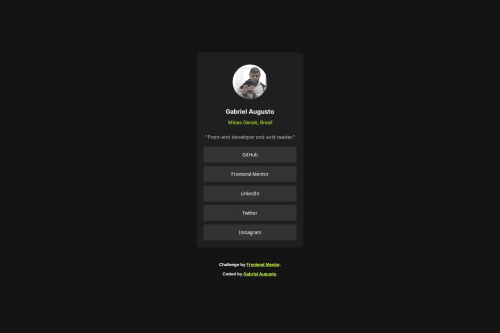
Social Links Profile – HTML, CSS, Flexbox e Media Queries

Solution retrospective
I'm most proud of successfully creating a fully responsive design using flexbox and CSS grid without relying on any external libraries or frameworks. The centralization of the card and attribution is clean, works across multiple screen sizes, and maintains its integrity whether viewed on mobile or desktop. I’ve also ensured the solution is simple, adheres to the design principles of Mobile-first design, and provides an optimal experience for users across different devices.
Next time, I would consider incorporating more dynamic elements like adding interactivity with JavaScript or integrating a framework like React or Vue.js to make the project more interactive. Additionally, I would aim to include more accessibility features, such as ARIA labels and keyboard navigation, to ensure a wider range of users can enjoy the content comfortably.
What challenges did you encounter, and how did you overcome them?One of the main challenges I encountered was ensuring the design was fully responsive across different screen sizes, particularly when trying to maintain the integrity of the layout on both mobile and desktop. At first, the centralization of the content wasn't perfect, and I struggled with ensuring the .card and .attribution sections stayed well-aligned in all views.
To overcome this, I utilized flexbox for the body and CSS grid for the social buttons, which allowed me to create a more fluid layout. I also applied media queries to make adjustments for different screen widths, ensuring the design adapted smoothly for mobile (375px) and desktop (1440px).
By focusing on a mobile-first approach, I was able to gradually build the design for larger screens, ensuring the layout remained functional and visually appealing on all devices.
This challenge taught me a lot about flexibility in design and how small adjustments can make a big difference in user experience across various devices.
What specific areas of your project would you like help with?would appreciate feedback on the responsiveness of the layout, specifically if there are any areas where the design might break or not look as expected on different devices or screen sizes. While I’ve used flexbox and CSS grid, I’m curious if there are better methods or optimizations to improve the layout even further.
Additionally, I’d love to receive suggestions on accessibility improvements, such as how to make the interactive elements (buttons and links) more accessible to users with disabilities. Are there any best practices I could implement to improve the overall accessibility of the page?
Lastly, if there are any performance enhancements that could be made, particularly in terms of CSS or media querie
Please log in to post a comment
Log in with GitHubCommunity feedback
No feedback yet. Be the first to give feedback on Gabriel Augusto's solution.
Join our Discord community
Join thousands of Frontend Mentor community members taking the challenges, sharing resources, helping each other, and chatting about all things front-end!
Join our Discord