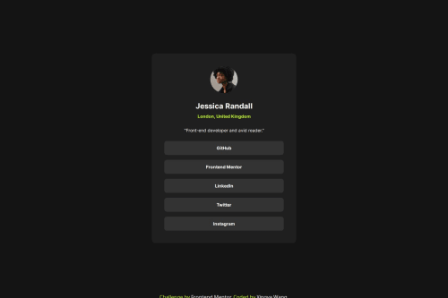
Social Links Profile Pseudo Class and Interactive Screensize

Solution retrospective
I learned about "stack" design in CSS.
I also learned to use rem more when working with font sizes. This allows the user to be able to adjust their screen font sizes according to their needs.
I have more experience working with margin in CSS. Understanding default margins applied through "inspect"/"devtools" and then resolve the margins respectively.
I learned about using @media to make CSS design more adaptive to user screensize.
I also learned about styling the pseudo classes:
- keyboard traverse through links
<a>; while<a>usually immediately wraps the text, the focused/hover state should usually style the wrapper of<a>-- thus one can usefocus-wiithin - a pseudo class can be think of a class, and so we can style children of a pseudo clas as well (e.g., style the
<a>element inside the pseudo classli:hover)
Finally, I can view and style the design more readily in terms of groups of elements (e.g., the design at first looks like 5 groups of elements, but are actually 4 groups of elements).
What challenges did you encounter, and how did you overcome them?I wanted to add <a> tag to wrap around the list items. However, the focus state automatically focuses <a> instead of the <li> items. After some searches, I learned about focus-within pseudo state which solved my problem.
I think I still don't have a systematic way to go about styling CSS. I usually start from the outer most element and then go inside each small element. Is there a better system out there? Welcome any suggestions.
Please log in to post a comment
Log in with GitHubCommunity feedback
No feedback yet. Be the first to give feedback on wxyzz22's solution.
Join our Discord community
Join thousands of Frontend Mentor community members taking the challenges, sharing resources, helping each other, and chatting about all things front-end!
Join our Discord