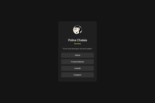
Social Links Profile Solution

Solution retrospective
It would be interesting to know how to make the padding-top and padding-bottom smaller for mobile devices without using media query. With clamp()? Has anyone tried this?
Please log in to post a comment
Log in with GitHubCommunity feedback
- @KapteynUniverse
Clamp is one way like you suggested. You can also combine min and calc together.
.card {
.
.
.
    /* padding: 40px 28px; */
    padding-block: min(calc(100vw / 20), 40px);
    padding-inline: min(calc(100vw / 40), 20px);
.
.
.
}
This means padding block (top-bottom) and inline (right-left) will be max 40px-20px but when 100vw/20-40 is smaller than 40px-20px, which is below 800px screen size, padding will be at that value. At 600px 30px-15px for example.
I think you don't need to set role=main since you already used main landmark.
Using max-width is nice, i also recommend you to use rem and a modern css reset or you can check Andy Bells reset too.
Marked as helpful - @jardellprod
I like how you modified the information provided to make it more personal. You also made the buttons hyperlinks I think that's actually pretty cool.
I think you succeeded in completing the project !
You also did a great job using max-width for the card size, this really made everything much more responsive. Also great use of the clamp function to size the text accordingly.
Marked as helpful


Join our Discord community
Join thousands of Frontend Mentor community members taking the challenges, sharing resources, helping each other, and chatting about all things front-end!
Join our Discord