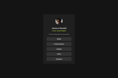
Social links profile solution

Please log in to post a comment
Log in with GitHubCommunity feedback
- @SandipTamangDev
Hey abrahmgerund!
You nailed the visual design—seriously, great job on that! That said, I think your code could level up with a few tweaks:
Your h2 could use a font-weight to match the design's boldness.
The container should span 100vh to center everything vertically, just like in the design.
Add some padding to the container—on smaller screens, the card touches the edges, which hurts the mobile UX.
Using semantic HTML would make the structure more meaningful: try replacing div with section, article for the card, and footer for the bottom part.
The hover color for the links should be green to align with the original design.
The card has a 10px border-radius, so using 5px on the inner buttons would make the curves feel more unified and smoother.
Join our Discord community
Join thousands of Frontend Mentor community members taking the challenges, sharing resources, helping each other, and chatting about all things front-end!
Join our Discord