Social links profile using CSS

Solution retrospective
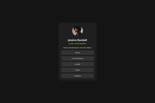
I’m most proud of how I was able to complete the layout to closely match the design, especially making it fully responsive using only HTML and CSS. I also liked how I managed the spacing, alignment, and used flexbox to position elements cleanly.
What challenges did you encounter, and how did you overcome them?One of the main challenges I faced was centering the content vertically and horizontally on the page. At first, I struggled with margin and padding, but I eventually solved it using display: flex with justify-content and align-items to center everything properly.
What specific areas of your project would you like help with?I’d like feedback on how to improve responsiveness, especially for very small or large screens.
Please log in to post a comment
Log in with GitHubCommunity feedback
- @stephany247
Hi Olisa,
Great work! The layout is clean, well-centered, and your styling is consistent. The hover effect on the buttons is also a nice touch — you're improving steadily! 👏
✅ What went well:
- Good use of Flexbox for layout.
- Nice contrast and spacing.
- Button styling and hover effect are on point.
🔧 What to improve:
- Missing
alttext on the profile image — always include one for accessibility. - Use
<a>instead of<button>for external links like GitHub, Twitter, etc. It’s more semantic and expected. - No need to wrap each button in a
<div>— it adds unnecessary markup. You can apply margins directly to the buttons instead. - Watch spelling: it’s “LinkedIn”, not “Linkeldn.”
- Consider adding a custom font like the original design (e.g., "Inter" from Google Fonts).
Overall, great progress — just clean up the structure a bit, and you’re on your way to writing professional-quality code. 💪✨
- @egorpya
Hi, good job on the project!
Several things I want to mention:
- Do not use <button> tag for links, use <a> instead. Buttons should only be used inside <form> or when a function should be activated.
- button:hover does not include changing color to grey, as shown in design images.
a:hover{ background-color: var(--green-color-from-style-guide); color: var(--grey-color-grom-style-guide) }- You can set border-radius with percentages, like this:
#avatar{
  border-radius: 50%; /* crops <img> to circle*/
}
Aside from that, you did a really good job! Keep it up!


Join our Discord community
Join thousands of Frontend Mentor community members taking the challenges, sharing resources, helping each other, and chatting about all things front-end!
Join our Discord