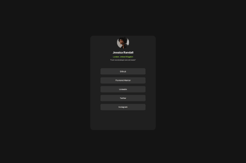
Social links profile using html and css

Solution retrospective
Next time I would make this site more functional.
What challenges did you encounter, and how did you overcome them?No challenge in particular. But I realized something, in the past two projects I mostly used px for dimensions, due to this my website was looking fine when I visited it from my pc, but it looked horrible on mobile and also the screenshot on Frontendmentor. This time I have used vh for giving dimensions. I hope it turns out fine.
Please log in to post a comment
Log in with GitHubCommunity feedback
- @DylandeBruijn
Hi @mayank1405,
Congratulations on completing another great project! I'm happy to see your progress. Very good that you decided to experiment with relative CSS units. You made a good start!
A bit of friendly constructive feedback:
- At the moment when you make the viewport smaller you get some overflow issues. The content in the card overflows out of the card. This is due to the
height: 58vh;you have on the card.
About vh:
vh stands for viewport height. This unit is based on the height of the viewport. A value of 1vh is equal to 1% of the viewport height. A value of 100vh is equal to 100% of the viewport height.
So when you resize the viewport the size of the card changes as well. In this specific project you don't want the card to resize. You want it to stay centered in the middle at a fixed width until the width of the viewport gets smaller and then the card scales with that. I'll give you a nudge in the right direction. Try setting the with of the card as a fixed value and let the content of the card decide the height. Again it's very good that you experimented with viewport units to get it to look better on mobile, it's just getting to know when and where to use the different units.
-
I suggest using pixel or percentage values for
border-radius. You generally don't use viewport units for theborder-radiusproperty because you want it to stay the same on any device. -
I see you use a lot of ID's. Am I safe to assume you do this because you want to style things specifically? It's alright to just use classes for this. You could name your
h2.card-titlefor example. And thepunder that as.card-description. You can read about when to use class or id here.
I hope this answers your questions. I would appreciate it greatly if you could mark my comment as helpful if it did help you out!
Marked as helpful - At the moment when you make the viewport smaller you get some overflow issues. The content in the card overflows out of the card. This is due to the

Join our Discord community
Join thousands of Frontend Mentor community members taking the challenges, sharing resources, helping each other, and chatting about all things front-end!
Join our Discord