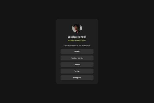
Social links profile using HTML and CSS

Solution retrospective
I was happy that I could finish this one fairly quickly without many issues.
What challenges did you encounter, and how did you overcome them?My area of opportunity with this as well as others are media queries. I'm still learning them and will improve as I go.
What specific areas of your project would you like help with?Any feedback is helpful.
Please log in to post a comment
Log in with GitHubCommunity feedback
- @gmagnenat
Good job on the solution! Here are some important things to improve:
Does the solution include semantic HTML?
- This is a list of links, so it would be better to use a
<ul>
(unordered list) for proper semantic structure. This makes it easier for screen readers to understand the number of items and improves navigation.
Is it accessible, and what improvements could be made?
- Avoid setting
font-size
in pixels on the<html>
tag. Let the browser apply its default size (usually 16px) so users who need larger text can adjust it easily. Read this article to understand that issue. Why you shouldn't use pixels for font-size - Remove
min-width: 100vw
on the<body>
. This causes overflow when zooming in because it includes the width of the scrollbar. The body naturally takes 100% width, so no need for extra styling. - Social links currently use a fixed height. Using
padding
instead would make them more flexible and avoid overflow if the text size changes.
Does the layout look good on a range of screen sizes?
- The height on your container is fixed. It should be flexible so it grows with the content. If you add more links, the height should adapt automatically.
- The width and height on your image container are not necessary. Let the image size be determined naturally to prevent layout issues.
Is the code well-structured, readable, and reusable?
- Use a modern CSS reset to start your styles from a clean slate. This reduces inconsistencies between browsers.
- There is strange formatting in your CSS. Consider using a tool like Prettier to clean it up and make it more readable.
- The negative margin on your
.intro-container
is not needed. This is a workaround to move it closer to the image. If you remove the forced height on the image container, you can remove this margin, and it will look cleaner.
Does the solution differ considerably from the design?
- The design looks mostly fine, but there are structural and CSS issues that make it less maintainable and harder to scale.
Let me know if you have any questions on these points.
Happy coding !
Marked as helpful - This is a list of links, so it would be better to use a
Join our Discord community
Join thousands of Frontend Mentor community members taking the challenges, sharing resources, helping each other, and chatting about all things front-end!
Join our Discord