


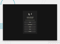


Hi, Looks good. The only small issues I see on this are:
- breakpoints in px instead of rem or em. This will cause problems on bigger projects for users with a different text size as the layout would not adapt layout correctly for those people.
- there is no space above and below the component. It touches my screen edges.
- text is not centered on the component so when I have a larger text size any text that wraps over two lines becomes aligned to the left, which looks odd.
- the location is not a h2. That would make the location the heading for all these links, not the person's name. It's just a paragraph.
- the alt text on the image doesn't describe the image
0
