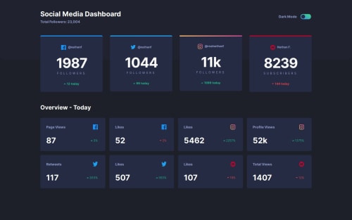
Not Found
Not Found
Not Found
Not Found
Not Found
Not Found
Not Found
Not Found
Not Found
Not Found
Not Found
Not Found
Not Found
Not Found
Not Found
Not Found
Not Found
Not Found
Not Found
Not Found

Submitted

Social media dashboard using React & Tailwind

#react#typescript#tailwind-css
P

@Francis7575

Desktop design screenshot for the Social media dashboard with theme switcher coding challenge

This is a solution for...

  • HTML
  • CSS
  • JS
2junior
View challenge

Design comparison


SolutionDesign

Solution retrospective


What specific areas of your project would you like help with?

Could anyone tell me how to remove the empty space at the bottom of the solution? please

Community feedback

P
Grace 27,870

@grace-snow

Posted

There are lots of accessibility challenges in this challenge that you need to pay attention to.

  1. The dark mode toggle is currently inaccessible. Because it's label on the control (the button) is just "toggle button". How would an assistive tech user know what that button does? If using a button it would need to be aria-labelledby by the "dark mode" text node's ID and it would need the aria-pressed attribute (where true equates to dark mode being active).
  2. On that note, you're making the application of that dark mode very complex. I recommend you check the tailwind docs as you can make this simpler I think where tailwind can apply the theme automatically for you (eg based off one class high up in the dom then using tailwind theme classes).
  3. The h1 doesn't usually ever go in a header. It should be the first heading within main. I don't think it matters for this challenge specially as its probably a one-page site but mentioning so you know for next time.
  4. That said, I would add a visually-hidden h2 before the first row of cards at the start of main. Assistive tech users commonly jump to the main landmark or by headings and would not know what this content is as it's currently untitled.
  5. In follower cards the icon img is acting as the card title. That means it needs to be in a heading element (h3 if you've added that h2 above) and the alt should only say the platform name not "icon".
  6. Text should never be in divs or spans alone. Use meaningful elements like paragraphs.
  7. A lot of the data in these cards will need extra visually hidden text to make the data make sense like "username:" before the username.
  8. The label like "followers" is definitely not a heading. To make sense it has to be read along with the number above it. That means they both need to be in a paragraph together. You can use spans inside that paragraph to style each part separately.
  9. "Arrow icon" causes a critical accessibility failure because it does not communicate the meaning of the image. I recommend you treat that image as decorative and include the label as visually-hidden text. It needs to conditionally communicate whether it is an "increase" or "decrease" based on whether it's arrow up or down being shown.
  10. The feedback on the other cards is very similar. Make sure the heading is meaningful like "Facebook likes" and the content makes sense including whether it's showing an increase or decrease in the stats.
  11. Lastly, it's optional, but I would find it beneficial for these cards to be in lists. That would tell screen reader users how many there are.

Marked as helpful

1

P

@Francis7575

Posted

Thank you so much for providing such detailed and valuable feedback on the accessibility challenges in the project. Your insights are incredibly helpful for improving the user experience for all users, including those who rely on assistive technologies. I appreciate your help and will definitely implement these recommendations to ensure better accessibility in the future. @grace-snow

1

Please log in to post a comment

Log in with GitHub
Discord logo

Join our Discord community

Join thousands of Frontend Mentor community members taking the challenges, sharing resources, helping each other, and chatting about all things front-end!

Join our Discord