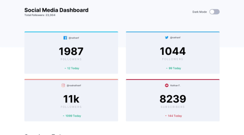
Social Media dashboard using SASS & Flexbox

Solution retrospective
I just have to questions :
- I struggled to make the top border with the gradient for Instagram. Is there an easy way to do it?
- Could you give me some basic feedbacks on ways I could improve my code (cleaner, more readable, etc)?
Please log in to post a comment
Log in with GitHubCommunity feedback
- @ApplePieGiraffe
Hey, Mathieu Céraline! 👋
Great job on this challenge! Your solution looks good, responds well, and the light/dark themes work great! 👍
I only suggest,
- Switching to a one-column layout for the statistics cards just a wee bit sooner than 395px so that the content inside the boxes doesn't look too squeezed and none of the text overflows its container.
Keep coding (and happy coding, too)! 😁
- Account deleted
.instagram {
  border-top: 4px solid;
  border-image-source: linear-gradient(
    to right,
    hsl(37, 97%, 70%),
    hsl(329, 70%, 58%)
  );
  border-image-slice: 1;
}
This is what I did for the top border for the Instagram box.
- @GerbenDol
Hi Mathieu. I think your solution for the top borders is solid, so don't worry about that. If you had issues with making it like this, try practicing with pseudo-elements more in your future solutions! 😁
I think you CSS is also looking good! The way you put every bit in their own section makes it very readable and easy to navigate. Keep it up! 🙌🏻


Join our Discord community
Join thousands of Frontend Mentor community members taking the challenges, sharing resources, helping each other, and chatting about all things front-end!
Join our Discord