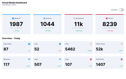
Not Found
Not Found
Not Found
Not Found
Not Found
Not Found
Not Found
Not Found
Not Found
Not Found
Not Found
Not Found
Not Found
Not Found
Not Found
Not Found
Not Found
Not Found
Not Found
Not Found

Submitted

Social Media Dashboard using SCSS, Flex, and Grid

@Kpersaud-Dev

Desktop design screenshot for the Social media dashboard with theme switcher coding challenge

This is a solution for...

  • HTML
  • CSS
  • JS
2junior
View challenge

Design comparison


SolutionDesign

Solution retrospective


Any feedback regarding layout and use of grid would greatly help. Thank you!

Community feedback

P
ApplePieGiraffe 30,545

@ApplePieGiraffe

Posted

Hi, Kevin Persaud! 👋

Nice effort on this challenge! 👏

I suggest,

  • Adding a max-width to the main container or wrapper to prevent the content of the page from becoming too wide when the width of the screen increases in the desktop layout.
  • Adding a little more space between the content of the page and the sides of the page (as in the original design).
  • Only using CSS grid on a container containing only the cards in the lower section of the site (not the cards + the heading of that section, as including the heading in the grid container seems to interfere with the layout a bit when the width of the screen decreases).
  • Perhaps increasing the size of the heading just a bit.

Hope those tips help. 🙂

Keep coding (and happy coding, too)! 😁

1

@Kpersaud-Dev

Posted

Hi ApplePieGiraffe,

Thank you very much for the helpful feedback! I'll definitely apply those best practices in my projects going forward.

Thanks again!

0

Please log in to post a comment

Log in with GitHub
Discord logo

Join our Discord community

Join thousands of Frontend Mentor community members taking the challenges, sharing resources, helping each other, and chatting about all things front-end!

Join our Discord