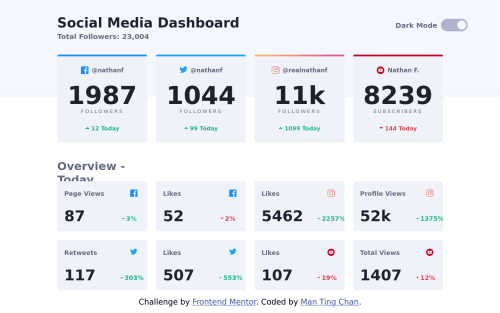
Social Media Dashboard with Theme Switcher using Vanilla JS & CSS Grid

Solution retrospective
I think I need to work on CSS padding. A lot of my methods for aligning items is not the best. I found getting the different card 'items' in the right place difficult and I wonder what's the best method for this?
Please log in to post a comment
Log in with GitHubCommunity feedback
- @elaineleung
Hi Man Ting, great attempt here! I can see where things can be challenging over all, and right now there are some parts that are a bit hard to troubleshoot due to how things are written, but I'll just share my general observation and how I'd do things differently.
The main issue is the way the HTML is structured, as well as the way that grid is being used for your main container, namely in how the spacing around the component is included as part of the grid, which is not something I advise doing. Generally you'd want to keep the padding/margin separate from the actual grid content, and the spacing can be taken care of by
max-widthorwidth: min().For the HTML, I see that you got the header (as in, the part that contains the title and the theme switcher) as part of the grid with the main content, and you even have the header background as another child of the grid. What I would do is separate the top header and the main content, and within the main content, I'd have two sections: one for the four boxes of total stats, and then one section for the other individual stats. For the header and the two main sections, I'd use a container that would have the same responsive width. Also, the grid component itself is supposed to be aligned with the header content (as in, the title and the theme switcher), but right now they are not aligned to have the same width. That is also something that can be taken care of with the container. Everything will kind of look like this:
// HTML

<body>
   <header>
      <div class="container">{ header contents here }</div>
   </header>
   <main>
      <section class="total-stats">
         <div class="container">{ contents here }</div>
      </section>
      <section class="individual-stats">
         <div class="container">{ contents here }</div>
      </section>
   </main>
</body>

// CSS
.container {
   width: min(90%, 80em); // this takes care of limiting width and provides spacing until limit is reached
   margin-inline: auto;
}
header .container {
  display: flex;
  justify-content: space-between;
}
main section .container {
  display: grid;
  grid-template-columns: repeat(4, 1fr);
  gap: 1rem;
}
I also see how you have a media query for the mobile view and one for the desktop view. This is actually not necessary and can be confusing. If you had this as a mobile first approach, then you just need the mobile styles in the main CSS and no need to write a media query for it, as you're doing double work here, which is unnecessary.
Anyway, I think this is all I can comment on for now, good luck!

Join our Discord community
Join thousands of Frontend Mentor community members taking the challenges, sharing resources, helping each other, and chatting about all things front-end!
Join our Discord