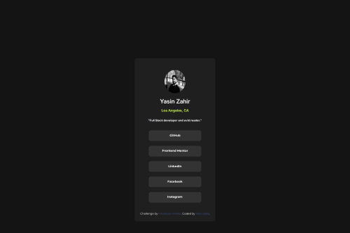
Social Media Profile Card

Solution retrospective
I'm most proud of how clean and responsive the final layout turned out. The dark mode aesthetic, centered layout, and semantic structure made the card feel polished and professional. I also kept my CSS organized and focused on accessibility, which made the whole project more maintainable and scalable.
If I were to do it again, I’d spend more time customizing the design beyond the base challenge—adding animations, transitions, and hover effects to elevate the interactivity. I’d also work on breaking out the project into smaller components using a front-end framework like React for practice.
What challenges did you encounter, and how did you overcome them?One challenge was getting the layout centered and responsive across different screen sizes while keeping the design clean. I initially struggled with aligning elements perfectly using div tags and margin: 0 auto; for centering, especially ensuring consistent spacing.
What specific areas of your project would you like help with?I'd like to brush up on my flexbox and grid, and also learn react and front end frameworks to be a more efficient front end dev.
Please log in to post a comment
Log in with GitHubCommunity feedback
No feedback yet. Be the first to give feedback on Yasin Zahir's solution.
Join our Discord community
Join thousands of Frontend Mentor community members taking the challenges, sharing resources, helping each other, and chatting about all things front-end!
Join our Discord