


Hi, I can see you've tagged this with accessibility but I'm afraid it is not accessible yet. Here are some things you need to fix:
- There is no need for the extra divs. Not an accessibility issue, just really confusing and makes the html hard to read. This is one div (card) with content inside. Keep html as simple as possible.
- Remove the divs wrapping each anchor. The list of links should be in an actual list instead.
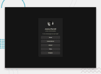
- Read the post in the resources channel on discord about how to write good alt text on images.
- The heading level is incorrect at the moment. A h4 would only make sense if this was child content of a section headed by a h3. There would need to be a h1, h2 and h3 all above this component. As this component is a stand alone page if expect the heading to be a h1.
- What you've marked up as small is not Smallprint. That should just be a paragraph.
- If links are set to open in a new tab that must be programmatically determinable to assistive tech users because it is unexpected behaviour. Either remove the target attributes or add visually hidden text to each link saying "(opens in a new tab)".
- It is better for performance to link fonts in the html head instead of css imports.
- Never limit the height of elements that contain text, including the body. It's fine to use min-height but not fine to use height because you are causing content to be cut off by limiting the height. (I also recommend using the flex column approach to center the component instead of grid and place content center. This is beause the css grid approach can cause content to overflow on the left and right , especially for users who need to use a large text size).
- ⚠️ Never set font size in px. This is a serious accessibility failure.
- The component must not have a width. It is overflowing my screen because of this. Instead, use max-width in rem only.
- The component must not have a height. This is the same principle as point 8 above. Let the browser do it's job and decide what height is needed based on the content. As soon as you limit the height you're introducing overflow bugs and making a component that is not robust for content authors.
- The component should have a little margin on all sides so it can't hit screen edges. Or a wrapping element can have a little padding to acheive this.
- Text align inherits so can be set at component level instead of repeating the property on different child elements.
- I wouldnt expect the avatar to need position relative or any large margins. That's an image that should be display block, and margin inline auto to horizontally center it.
- The whole card should have padding.
- The links should have at padding on all sides.
- The anchors should be display block or width 100%. They do not need different classes to each other or anything doing in css to position them! Html block elements stack vertically by default.
- This challenge does not need a media query at all. If you did need a media query in other challenges, it would be a min width media query only as you should be working mobile first for almost all components; and the media query would need to be defined in rem or em not px.
- Make sure you're using the object fit property on the avatar if the original image is not square so it doesn't get distorted.
Overall I think you've just overcomplicated this challenge. If you've not had feedback like the above before I think it will be very important for you to go back through previous challenges and refactor them.
0
