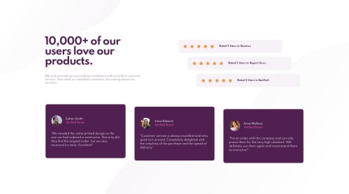
Social Proof Challenge using Flexbox with desktop and mobile design!

Solution retrospective
Can I get some feedback on my CSS of how I set up the staggered star ratings and also for the user reviews? In the CSS file, lines 87-100 and lines 133-148. I'm wondering if there is a cleaner way of setting these up?
Please log in to post a comment
Log in with GitHubCommunity feedback
- @zuolizhu
Hey Stanley,
Nice try on this challenge! Both desktop and mobile views look good 👍!
The stars are stretched in height when the screen size is below 1440px 🧐.
One way you can fixed this is to remove the
height: 30%;for the.ratingStars img {}. There is no need to change the height or width of the star. At the same time, change the width of. ratingStarsto117px(This is the actual width from the sketch file)..ratingStars { align-items: center; display: flex; justify-content: space-between; margin-left: 32px; margin-right: 32px; width: 117px; min-width: 117px; } .ratingStars img { /* height: 30%; */ }I think this can give you a good result of the stars.
By the way, you can open the .svg file in your text editor, and copy the code into the HTML file, something like this:
// Instead of using <img> tag 🙅♂️<img src="./images/icon-star.svg" alt="star rating">🙅♂️ // Using svg code directly 🙆♂️<svg xmlns="http://www.w3.org/2000/svg" width="17" height="16"><path ... /></svg>🙆♂️The reason I prefer this way, is because each
<img>tag will make a request to fetch the image file. Andsvgcan be rendered directly in the browser from the HTML code, so that you can reduce the number of requests by adding it directly in your code. Which can speed up your page loading a little bit 😉.There is nothing wrong to use margins to make the staggered patterns. Your code from lines 87-100 and lines 133-148 are good.
However, the elements above 375px are squeezed together. And I found 👀 you have
@media screen and (max-width: 375px)to the<section class="upper">.That means the the code with in
@media screen and (max-width: 375px)will be only applied if the screen size is below or equal to375px.And I think change it to
@media screen and (max-width: 1024px)will fix the squeezed problem.Hope my nerdy comment helps🤓.
Happy coding🙌!

Join our Discord community
Join thousands of Frontend Mentor community members taking the challenges, sharing resources, helping each other, and chatting about all things front-end!
Join our Discord