Not Found
Not Found
Not Found
Not Found
Not Found
Not Found
Not Found
Not Found
Not Found
Not Found
Not Found
Not Found
Not Found
Not Found
Not Found
Not Found
Not Found
Not Found
Not Found
Not Found

Submitted

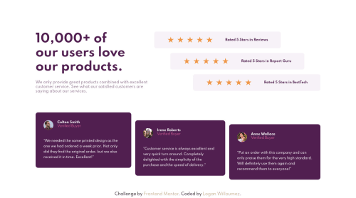
Social Proof section

@LoganWillaumez

Desktop design screenshot for the Social proof section coding challenge

This is a solution for...

  • HTML
  • CSS
1newbie
View challenge

Design comparison


SolutionDesign

Solution retrospective


Hello ! This is my next challenge, it was a bit more difficult, but it was really fun to play with !

If u have any suggestion for improving my code or if I did it wrong, don't hesitate, it's when we fall that we learn :D

Best,

Logan

Community feedback

@MikeBish13

Posted

Hey, great job! Your solution looks good.

My main feedback would be that the site looks a little disjointed on the larger desktop screen sizes. In particular:

  • The font of the main heading looks a little small.
  • The 5 star review sections are unevenly spaced and don't match the design. I think you have made this hard for yourself by creating the indentions using different margins at different screen sizes. One solution or improvement could be to consider using the align-self property for each of the children within the flexbox. For example you could set the align-self properties of the children to flex-start, centre, flex-end to ensure the spacing always stays consistent.

Hope that helps!

2

@LoganWillaumez

Posted

@MikeBish13 Hey, thanks for your feedback :)!

Your advice was very good, I reworked the site so that it is closer to the original design, and use the flex start, end and center for the design.

Thank you again,

Best,

Logan

0

Please log in to post a comment

Log in with GitHub
Discord logo

Join our Discord community

Join thousands of Frontend Mentor community members taking the challenges, sharing resources, helping each other, and chatting about all things front-end!

Join our Discord