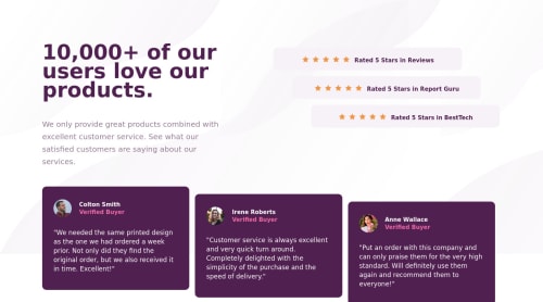
Social proof section

Solution retrospective
Mobile version and desktop version are completely different and that was my challenge.
My other challenge is getting the ratings box and the buyers box to appear next to each other BUT not in a straight line next to each other. I did my best to do that.
When building this project, I find difficulty in making the entire body to be center for the desktop version. I think I made a mistake with the margin or something else. Not sure.
Overall, I'm glad to push through BUT I think my CSS code is very messy.
Feel free to take a look at my code and my final result. Point out any mistakes I've made. Give me any lessons, tips, feedbacks, or ideas. I still have more to learn.
Please log in to post a comment
Log in with GitHubCommunity feedback
- @vanzasetia
Hi! 👋
I suggest removing the alternative from all the star icons (
alt=""). Those are decorative images. They don't add any meaningful content for the users. Also, they create a lot of noise for screen reader users.Here are some more suggestions:
- There should not be any inline styling. Put all the styling in the external CSS.
- Wrap the quote with
blockquote. - Remove the word "picture" from the alternative text. There's no need to tell the users that it is a picture or image since you are already the
imgtag. - Use the
emunit for media queries. It adapts when the users change their font size setting. Here are some references. - Prefer unitless numbers for line-height values to avoid unexpected results. The MDN documentation of
line-heightexplains it well. - Use single class selectors for styling whenever possible instead of
id.idhas high specificity which can lead to a lot of issues on the larger project. It's best to keep the CSS specificity as low and flat as possible. - There's no need for absolute positioning. You can use flexbox to align the ratings with the text on the desktop layout.
- To make the content in the middle of the page, I suggest making the
bodyelement as a flex container. Then, setmin-height: 100vhto make the content vertically center.
I hope this helps! Happy coding!
Marked as helpful

Join our Discord community
Join thousands of Frontend Mentor community members taking the challenges, sharing resources, helping each other, and chatting about all things front-end!
Join our Discord