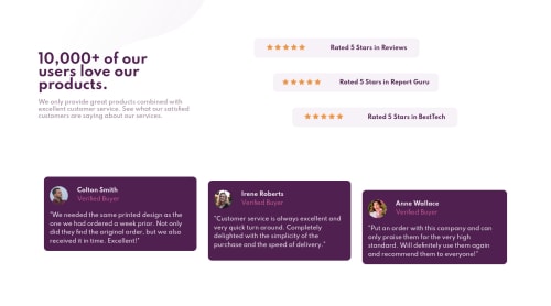
Social proof section challenge using css flexbox

Solution retrospective
Any feedback would be awesome! I have tried to do this as fast as I could. I have used a lot of flexbox, let me know if the code is too redundant. I have a question: How do I write the part which change the size of the screen: @media only screen and (min-width: 800px), how is the most common way to do this? Thanks for reading >.<
Please log in to post a comment
Log in with GitHubCommunity feedback
- @darryncodes
Hi Rodrigo,
Nice one - well done on completing this solution!
Two tips:
- you could consider using transform: translate x/y to achieve the staggered card affect instead of margin. I think it might be a little simpler from a responsive design perspective
- also Flexbox has a property called gap, it makes life a lot easier spacing out Flexbox child elements but it's not completely adopted yet
Keep coding!
Marked as helpful - @anoshaahmed
To get rid of the accessibility issues shown in your Report, wrap everything in your body in
<main>... OR use semantic tags ... OR giverole=""to the direct children of your<body>... Click here to read moreGreat job! :)
Marked as helpful - @rodrigovn
thank you! i will keep that in my notes
- @rodrigovn
Thank you darryn I will definately keep that in my notes


Join our Discord community
Join thousands of Frontend Mentor community members taking the challenges, sharing resources, helping each other, and chatting about all things front-end!
Join our Discord