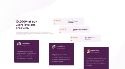
Social proof section - HTML/CSS

Solution retrospective
Hi mentors,
I know this is not perfect, but I have tried my best. I would like feedback specifically on the positioning of the background images, the use of pseudo elements and the rules I have written to make it responsive.
Thanks all
Please log in to post a comment
Log in with GitHubCommunity feedback
- @grace-snow
OK I've just had a really good look through this on desktop and recommend starting styles again to be honest.
General principles
- don't throw padding and margin at everything. Choose carefully and consistently
- don't nest extra divs and flex wrappers unless you need to
- don't try to achieve a layout with position absolute/relative and top/right/bottom/left. If you find yourself doing that often, something has gone wrong and there will be a better way to do it.
- if a background image doesn't need any unusual other features, just make it a background image, no need for pseudo elements or transforms. Background position will do all you need.
- Leverage the gap property to space items out in flexbox or grid
- Unless you are comfortable with CSS grid, consider changing your HTML markup so you have a top flex section, and a bottom flex section. Flex is for one-dimensional layout, grid is for two. At the moment you have the intro, stars and reviews all as direct children of the wrapper, which means you should be using a grid layout there
- Don't add sr-only headings unless they are really warranted
- If you are adding sr-only elements, try using nth-of-type rather than odd 'child' numbers that will give you (because of the extra / unexpected child elements in the HTML)
Here is what I changed in browser. Hopefully going through this will help you understand some of the choices I'm making and why:
/* styles.css | https://social-proof-section-aj-menon.vercel.app/styles/styles.css */ @media only screen and (min-width: 900px) { .main-wrapper { /* position: absolute; */ } .container { /* flex-direction: row; */ /* text-align: left; */ /* position: relative; */ /* top: 10rem; */ /* left: 0; */ grid-template-columns: repeat(2, 1fr); grid-template-areas: "intro stars" "reviews reviews"; } .review-ratings { /* max-width: 55vw; */ /* position: relative; */ /* top: 2rem; */ /* grid-area: ""; */ align-items: flex-start; } .reviews { /* position: absolute; */ /* top: 18rem; */ /* left: 0; */ grid-area: reviews; display: flex; gap: 2rem; } .reviews > .user-review { /* width: 20vw; */ } .reviews > div.user-review:nth-child(2) { /* position: absolute; */ /* top: 2rem; */ /* left: 25rem; */ } .reviews > div.user-review:nth-child(3) { /* position: absolute; */ /* top: 5rem; */ /* left: 50rem; */ } .review-ratings .ratings { /* display: flex; */ /* flex-direction: row; */ /* padding: 0.5rem 0.5em 0 0.5em; */ /* justify-content: flex-start; */ width: calc(100% - 4rem); max-width: none; } .ratings:nth-child(3) { /* margin-left: 10%; */ } .ratings:nth-child(5) { /* margin-left: 30%; */ } .title-container .info { text-align: left; } .title-container .title { /* max-width: 20rem; */ max-width: 30ch; } .main-wrapper::before { /* transform: translate(-50%, -50%); */ /* background: url(../images/bg-pattern-top-desktop.svg) no-repeat bottom right; */ /* top: 0; */ /* left: 0; */ /* background-size: 50rem; */ background: url(../images/bg-pattern-top-desktop.svg) no-repeat top left; background-size: 100 vw; } .ratings .rating-title { /* padding: 0.5rem; */ /* margin-left: 4rem; */ } .main-wrapper::after { /* transform: translate(-50%, -50%) scale(1.5); */ /* background: url(../images/bg-pattern-bottom-desktop.svg) no-repeat top left; */ /* top: 100%; */ /* left: 100%; */ background: url(../images/bg-pattern-bottom-desktop.svg) no-repeat bottom right; } } .main-wrapper { /* min-width: 100vw; */ /* position: relative; */ /* overflow: hidden; */ /* z-index: -1; */ /* margin: 0 auto; */ justify-content: center; align-items: center; max-width: 1100px; margin: 0 auto; } body { /* background: var(--white) fixed; */ background: var(--white); overflow-x: hidden; } .container { /* display: flex; */ /* flex-direction: column; */ /* align-items: center; */ /* justify-content: space-around; */ /* grid-template-areas: ""; */ /* grid-template-areas: "intro intro intro stars stars stars" ""; */ /* grid-template-areas: "intro" " "reviews reviews""; */ display: grid; grid-template-columns: 1fr; grid-template-areas: "intro" "stars" "reviews"; grid-gap: 1.5rem; gap: 1.5rem; max-width: 600px; } .ratings { /* padding-bottom: 0.5rem; */ /* margin-bottom: 1rem; */ padding: 0.5rem; display: flex; flex-direction: row; padding: 0.75rem; justify-content: center; align-items: center; max-width: 480px; } .info { /* font-size: 0.815rem; */ /* padding: 0.2rem; */ font-size: 0.9375rem; line-height: 1.5; max-width: 35ch; margin: 0 auto; margin-top: 1.5rem; } h1.title { font-size: 2.5rem; line-height: 1.15; margin: 0 auto; max-width: 16ch; } .main-wrapper::before { /* transform: translate(0, -80%); */ top: 0; left: 0; z-index: -1; } .ratings img { /* padding-top: 1rem; */ } .ratings > p.rating-title { /* font-size: 13px; */ } .review-ratings { /* width: 100%; */ grid-area: stars; display: flex; flex-direction: column; justify-content: center; gap: 1rem; align-items: center; } .reviews > .user-review { /* padding: 0.5rem; */ /* margin-bottom: 1rem; */ padding: 1rem; } .user-details { /* padding: 1rem 1.5rem 0 1.5rem; */ align-items: center; gap: 1rem; } .user-details p.user-name { /* padding: 0.5rem; */ /* margin-top: -0.2rem; */ /* margin-left: 0.5rem; */ margin: 0; } p.review { /* padding: 1rem 1.5rem 1rem 1.5rem; */ margin: 0; margin-top: 1.5rem; } .main-wrapper::after { /* transform: translate(0, 60%); */ content: ';; } .reviews { /* margin-top: 1rem; */ } /* Inline #2 | https://social-proof-section-aj-menon.vercel.app/ */ .title-container { grid-area: intro; } .rating-title { margin: 0; text-align: left; margin-inline-start: 1rem; font-size: 0.875rem; } .ratings:last-child { margin-left: auto; } .ratings:nth-of-type(2) { margin-left: 2rem; } .user-review:last-of-type { margin-top: 3rem; margin-bottom: -3rem; } .user-review:nth-of-type(2) { margin-top: 1.5rem; margin-bottom: -1.5rem; note: should be in mq; } .user-review:last-of-type { note: should be in mq; } .ratings:nth-of-type(2) { /* note: should be in mq\\; */ note: should be in mq; } .review-ratings > .sr-only { note: remove these; } .ratings:last-child { note: should be in mq; } .container { max-width: none; note: should be in mq; } - @grace-snow
Hi
Looking on mobile all looks good. It looks like you've had some issues with desktop from the preview though.
A few suggestions
- remove the first two Sr-only headings like
<h1 class="sr-only">Social Proof Section </h1>. You can only have one h1 and this solution already has one, they're not needed. - the third one is helpful but should be a h2
- you definitely don't want to position absolute the main-wrapper
- you also don't want to zindex - 1 that main wrapper. If you need to use zindex use it on the pseudos.
- Or just put the background images as background images on the body or main wrapper (using background-properties)
- as already suggested, no overflow Hidden should be necessary
Not sure what else to suggest as it's hard to debug a desktop layout on my phone. I hope these help to start with ☺
- remove the first two Sr-only headings like
- @pikapikamart
Hey upon looking you solution, opened in dev tools, your seems got cut off and I can't scroll down. Upon looking further in your stylings, your
overflow: hiddenis the one causing this that was declared in yourmain-wrapperselector. Well setting anoverflowsometimes helps you, but remember that when you position an element in absolute, it goes out of the flow right, it still have the height, but the container of it does not, especially when the container of it have no specificheightstyling declared to it. So when you overflow it to hidden, the content of it gets hidden but not working properly since there is no height to element that you styledoverflow: hidden.It might get confusing, but refactoring will be a good idea in here. If you need more help about it, just leave your query in here okay ^^


Join our Discord community
Join thousands of Frontend Mentor community members taking the challenges, sharing resources, helping each other, and chatting about all things front-end!
Join our Discord