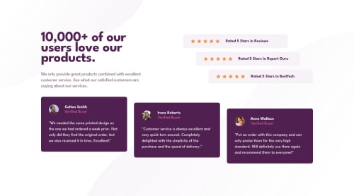
Social Proof Section using Flexbox

Solution retrospective
I opted to design this webpage with a mobile-first workflow. I feel like it was more work in the long run, but it worked out.
Learned that letter-spacing can have negative values to bring the letters much closer together.
I played a lot with the concept of max-width for mobile as I didn't like the max-width for the background for the rating on medium screen sizes (between 500px & 1100px particularly).
I feel like I heavily relied on flexbox for this challenge, and I'm not sure that was the best way to approach it. I am wondering if there's another way to approach this challenge that would be easier. Or perhaps more traditional HTML?
Please log in to post a comment
Log in with GitHubCommunity feedback
No feedback yet. Be the first to give feedback on Gabriel Montplaisir's solution.
Join our Discord community
Join thousands of Frontend Mentor community members taking the challenges, sharing resources, helping each other, and chatting about all things front-end!
Join our Discord