


バレンタイン 😈• 64,190
@VCarames
Posted
Hey there! 👋 Here are some suggestions to help improve your code:
- The profile images
alt tagsneed to be improved ⚠️. It should state the following; “Headshot of -person’s full name-“
More Info:📚
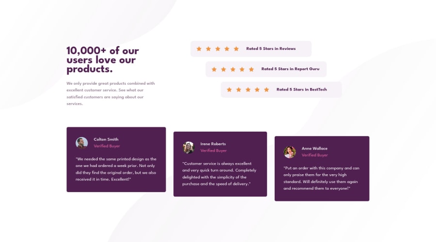
- For the testimonials, it is best ✅ to to wrap each individual testimonial component in a
figureelement, the individuals information should be wrapped in afigcaptionelement and lastly, the testimonial itself should be wrapped in ablockquoteelement.
Code:
<figure>
   <blockquote></blockquote>
   <figcaption></figcaption>
</figure>
More Info:📚
- Your
CSS Resetis being underutilized. 😢 To fully maximize 💯 it, you will want to add more to it. Here are some examples that you can freely use 😁: Josh Comeau Reset Eric Meyer Reset
- For improved accessibility 📈 for your content, it is best practice ✅ to use
remfor yourfont-sizeand other property values. Whileemis best formedia-queries. Using these units gives users the ability to scale elements up and down, relative to a set value.
If you have any questions or need further clarification, feel free to reach out to me.
Happy Coding! 🎆🎊🪅
Marked as helpful
0

