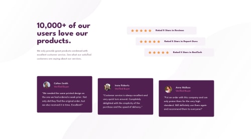
Social Proof Section Page using CSS Grid and Flexbox

Solution retrospective
Any comments/advice regarding the work will be greatly appreciated. :)
Please log in to post a comment
Log in with GitHubCommunity feedback
- Account deleted
Hi Arey,
This looks great, well done! 😊 Here's two things I'm seeing:
-The mobile layout kicks in at too small a width - The screen has to get small enough that the desktop layout cannot fit in its entirety anymore, so you get an horizontal scrollbar. I would edit the media query to make it so that it switches to the mobile layout before the desktop layout can't fit anymore.
-The ratings-flex containers are not centered on the mobile layout from about 515px to 460px screen width. I wasn't sure if you intended for this or if you wanted them centered/taking all the available space. I think it looks great the way you currently have it, but figured it was worth mentioning 😊
Marked as helpful
Join our Discord community
Join thousands of Frontend Mentor community members taking the challenges, sharing resources, helping each other, and chatting about all things front-end!
Join our Discord