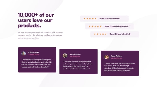
Not Found
Not Found
Not Found
Not Found
Not Found
Not Found
Not Found
Not Found
Not Found
Not Found
Not Found
Not Found
Not Found
Not Found
Not Found
Not Found
Not Found
Not Found
Not Found
Not Found

Submitted

Social proof section (Tailwind CSS 🎨)

#accessibility#lighthouse#pwa#tailwind-css#semantic-ui

@MelvinAguilar

Desktop design screenshot for the Social proof section coding challenge

This is a solution for...

  • HTML
  • CSS
1newbie
View challenge

Design comparison


SolutionDesign

Solution retrospective


Hi there 👋, I’m Melvin, and this is my solution for this challenge. 🚀

🎁 Features:

  • Achieved 100% in Lighthouse score for performance, accessibility, best practices, and SEO. 📊
  • Progressive Web App (PWA) support. 📱🌐
  • Utilized TailwindCSS for responsive styling. 🎨
  • Codebase is well-maintained and formatted using Prettier. 💻

🛠️ Built With:

  • TailwindCSS. 🎨
  • npm - prettier - prettier-plugin-tailwindcss. 💻

Thank you. 😊✌️

Community feedback

P
Rupali 400

@rupali317

Posted

Hello @MelvinAguilar

Excellent work on completing this challenge.

I went to my Chrome browser and went to the browser settings and modified the font size settings to "very large" and I noticed that the the profile pics were elongated vertically. Moreover, the stars were also appearing in another line. When I change the font size setting to "very small", the profile pics were appearing squarish. The stars were appearing quite big as compared to the surroundings. You might want to take a look at it.

Besides that, I have a general suggestion: Consider using css grids since it is more powerful than css flexbox. Flexbox handles one-dimensional layout whereas grids handles one-dimensional as well as two-dimensional layouts. For example, in the rating section - desktop view, they appear in a stair-way kinda manner. So in a grid format, there are basically 5 columns and 3 rows to represent it. So you can use grid-template-areas and assign grid areas to the individual items inside it. Using grid-template-columns, you can assign the width of the columns. I suggest you draw the grids on a paper and then see how the rating section fits in it. My similar comment for the testimonial section.

Refer to Kevin Powell's video on learning the CSS grid the easy way

Marked as helpful

3

@MelvinAguilar

Posted

@rupali317 Thank you very much for the comment. It's a beautiful feedback; I will definitely look into the issue when changing the font size. Thanks for your time.

Note: I think I've figured out what I did wrong. I'll try to fix it when I can.

Update: Updated solution, fixed the issue of distorted images, changed Tailwind breakpoints to rem for better font-size adaptation.

Happy coding and happy new year !

4
P
Rupali 400

@rupali317

Posted

@MelvinAguilar Good job! I checked your site! It looks perfect!

Marked as helpful

1
P
Rupali 400

@rupali317

Posted

I will be submitting my solution on the social proof challenge soon.

To, @MelvinAguilar I noticed you used .sr-only class, which I also want to include in my solution.

I experimented with that class and noticed that these two properties seem to be sufficient for sr-only class.

.sr-only {
  position: absolute;
  clip: rect(0,0,0,0)
}
  1. What are your thoughts on the above?
  2. Also, I was surprised that the position absolute had to be used in conjunction with the clip. I am not yet sure why. I thought the clip would be enough. I would love to hear your thoughts on this.
1

@MelvinAguilar

Posted

@rupali317 In more modern browsers, I think your solution works wonderfully. It's an interesting comment. The sr-only class is a standard class for visually hiding text, and what you're saying is true – these two lines can perfectly hide text.

However, the sr-only class is a bit old. Years ago, there wasn't much compatibility with the clip property, so the workaround was enclosing all the text in 1px and moving it off the screen. Setting width: 1px and height: 1px; contained everything in 1px, overflow: hidden; hid the excess of the pixel, and position: absolute took it out of the screen. Padding and margin set to 0 and -1 were used to overwrite any default margin and padding imposed by the browser, even in cases like * { margin: 1rem } to ensure it doesn't affect the sr-only class.

The more modern approach is to apply the clip, but some people maintain other styles for those old browsers that lack support for the clip property and for people who don't use any CSS reset.

Personally, using only the clip property doesn't work for me; I have to use at least position: absolute to hide the text. Maybe it's an issue with my browser.

I hope this helps!

2
P
Rupali 400

@rupali317

Posted

@MelvinAguilar Thanks for the detailed explanation

0
P

@Mitko90

Posted

I just wanted to drop in and say:

You are a master at perfection. 🙌️🙌️🙌️

1

@MelvinAguilar

Posted

@Mitko90 Thank you so much! 🌟 Your kind words mean the world to me! 🤗 I appreciate your encouragement! 🙏✨

1
MOHAMAD 60

@mohamad-hajilo

Posted

Excellent 👌👌👍👍👍

1

@truong231298

Posted

@MelvinAguilar you are the marter of tailwind-css, you make your challenge so beutifull with [2.4375rem], [1.4375rem]... wow, i had followed you and learn more about it. Keep doing your work, i will always be with you.

0

@kavicoder45

Posted

✋Hi bro, I hope you're doing well. I have some doubts about your project. I noticed that your webpage is responsive even when I zoom in and out of the web browser. However, my solution is not responsive; when I zoom in and out of the web browser, it creates unwanted gaps between the elements. I really like all of your projects. 💁‍♂️Could you please provide a roadmap for me to learn complete front-end web development? It would be really helpful for me to master this field. Also, could you share the resources you followed to learn front-end development?😊😊

0

Please log in to post a comment

Log in with GitHub
Discord logo

Join our Discord community

Join thousands of Frontend Mentor community members taking the challenges, sharing resources, helping each other, and chatting about all things front-end!

Join our Discord