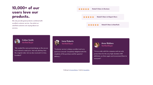
Social Proof Section using Bootstrap 5 and Flexbox

Solution retrospective
I tried to create a responsive design for desktop, tablet and mobile. I am open to suggestions and tips for improvement. Thank you.
Please log in to post a comment
Log in with GitHubCommunity feedback
- @correlucas
👾Hello Hamsalekha, Congratulations on completing this challenge!
You did a really good work here putting everything together, something you can improve its your code html markup and semantics. You can replace the
<div>that wraps each card with<article>you can wrap the paragraph with the quote with the tag<blockquote>this way you'll wrap each block of element with the best tag in this situation. Pay attention that<div>is only a block element without meaning.Use units as
remoreminstead ofpxto improve your performance by resizing fonts between different screens and devices.To save your time you can code you whole page using
pxand then in the end use a VsCode plugin called px to rem heres the link → https://marketplace.visualstudio.com/items?itemName=sainoba.px-to-rem to do the automatic conversion or use this website https://pixelsconverter.com/px-to-rem✌️ I hope this helps you and happy coding!
Marked as helpful - @mattari97
Hello Hamsalekha. Good job on completing this challenge 🎉🎉🎉.
I have some feedback for you.
-
I see that you used the
floatproperty on many of your elements. If I can give you an advice, it would be to try rethink your layout but using flexbox. Float is hard to use and leads to a lot of side effects. Float is a more modern and simple way to create layouts. Check this link to learn everything about it. -
I also see that you always wrap your elements with unnecessary containers. You should try to keep you markup as light as possible which will be easier with the flexbox property as well.
-
On my phone the content of your cards is overflowing their containers (the bottom of the text goes out of the card). It happens because you applied a fixed height to your cards. As a general rule you should not set a fixed height on any elements. If you really think you need it; a
min-heightis ok and will give you elements the ability to grow if the content is too long.
I would say that the best thing you could do now is try the same challenge with a different mindset. If you have difficulties you can look at this solution from @elaineleung.
I wish you happy coding and keep going ! Peace 😊
Marked as helpful -


Join our Discord community
Join thousands of Frontend Mentor community members taking the challenges, sharing resources, helping each other, and chatting about all things front-end!
Join our Discord