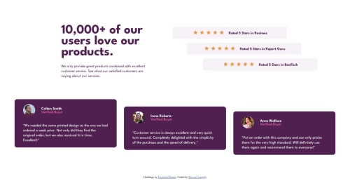
Social Proof Section using CSS Flexbox and Mobile First Workflow

Solution retrospective
This Challenge was a lot of fun. The design looks simple and I got to use lots of flexbox. It really boosted my confidence on using it. This was also my first time using mobile first workflow. In this challenge, I used position property. So yeah it was nice. I would like to know which units to use when? like what for headings, width etc etc
Any advice about making responsive layouts?? Your Feedback is appreciated
Thank you
Please log in to post a comment
Log in with GitHubCommunity feedback
- @devaramnye
This project would give you a good practice in Grid, just as info. Flexbox is cool, but having the opportunity to use both in different cases is a good point. A specially if you have like in this project where you can build templates with two axis at once.

Join our Discord community
Join thousands of Frontend Mentor community members taking the challenges, sharing resources, helping each other, and chatting about all things front-end!
Join our Discord