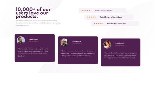
Social proof section using Grid and Flexbox

Solution retrospective
Feedback will be appreciated :)
Please log in to post a comment
Log in with GitHubCommunity feedback
- @RenszCamacho
Hiya 👋🏻 mariaUrda. Well done my friend 👏👏👏. You have done a fantastic job on this challenge 👌, and it’s responsive 💯.
Just I few suggestions in my humble newbie opinion. 😊
The backgrounds-images are not in place, at least not on my screen, so it looks good on all screens. I would give the body a
min-height: 100vhYour user testimonial images are slightly big, I would do something like this:
.card-bottom-picture { border-radius: 50%; width: 3rem; height: 3rem;Hopefully, it helps.
Happy coding🧑💻
- @SzymonRojek
Hi Maria,
Well done :D, good job!
I have checked your HTML and have a few tips for you if you don't mind:
- you have used so many divs but we have also semantic tags. Divs are semantically inert elements — elements that don’t really do or say anything, of course, they are important too. You can change a bit the HTML structure by using semantic tags;
- don't need to use words like picture or image, photo, icons in the alt text as it's already announced as being an image => we can easily type the name like alt="Jonathan" etc; Also, it is good to ask what kind of role img does have, for example: if we have decorative img - in these cases, a null (empty) alt text should be provided (alt="") so that they can be ignored by assistive technologies, such as screen readers;
- you didn't use the main h1: just to let you know, you should only use one h1 per page. Using more than one will not result in an error, but using only one is seen as a best practice. It makes logical sense => h1 is the most important heading, and tells you what the purpose of the overall page is (generally please read about headings h1-h6);
- you have got HTML issues report above (please fix the code as recommended);
- I suggest that you can familiarize yourself with BEM naming convention (after using it you will see many profits);
- design: from mobile size till 1000px is a huge gap so you can work still on RWD for tablets (check it out by the inspector);
Finally, congrats! Please, don't forget to upvote any comments on here that you find helpful. That's it from me. Hopefully, it will help you.
Greetings :D
- @dev-ted
Hi Maria, this is really good You write clean and readable CSS Keep it 🔥🔥🚀🚀🚀


Join our Discord community
Join thousands of Frontend Mentor community members taking the challenges, sharing resources, helping each other, and chatting about all things front-end!
Join our Discord