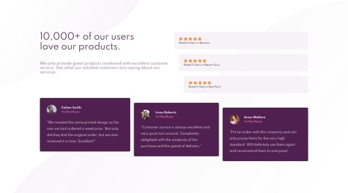
Not Found
Not Found
Not Found
Not Found
Not Found
Not Found
Not Found
Not Found
Not Found
Not Found
Not Found
Not Found
Not Found
Not Found
Not Found
Not Found
Not Found
Not Found
Not Found
Not Found

Submitted

Social Proof Section Using HTML CSS

#accessibility#backbone
Alejandro• 200

@Alejandro1709

Desktop design screenshot for the Social proof section coding challenge

This is a solution for...

  • HTML
  • CSS
1newbie
View challenge

Design comparison


SolutionDesign

Solution retrospective


What can i improve??

Community feedback

Raymart Pamplona• 16,140

@pikapikamart

Posted

Hey, glad to review another solution of yours. For desktop state, it looks fine but needed those font-weight to be present to create a hierarchy and each review container is too wide and the stars and review should be in a single row. The site is responsive which is really nice, I would just suggest for padding in the body tag to prevent the layout from touching the screen. Mobile state looks great as well.

Others already gave their feedback on this one which is really nice, just going to add some suggestions as well:

  • The br tag inside the h1 is not really needed. What you can do is that, set a max-width on the h1 so that the text will be wrapped on their own. Adjust until you get the desired look.
  • Each of those stars could have been used as a value for the background property. Remember that background can accept multiple images, this way, you won't have to create those extra img tags.
  • If you insist on using img tags for each stars, then use an alt="" and aria-hidden="true" on each of the img since they are all decorative images.
  • For each of the testimonial card, you can use this markup below for better navigation when using screen-reader using blockquote:
<figure>
  <img src="" alt={person name}>
  <blockquote>
    <p> {qoute in here}</p>
  </blockquote>
  <figcaption>
    person name
    <p>
      person role
    </p>
  </figcaption>
</figure>

Though you would need to use display: grid on the figure so that you could place each item properly like in the design.

  • Each person's name doesn't really need to be heading tags, but if you still insist, use h2 instead of h3 so that heading tag level won't be skipped.

Those only. Again, great job for this one.

Marked as helpful

1

Alejandro• 200

@Alejandro1709

Posted

@pikapikamart Thank you so much!

1
Cody• 170

@Cod-Bigg

Posted

Hey Alejandro, See if you can fix the width of the five star reviews on the desktop view. It looks like you have a lot of empty space on the right. other then that, see if you can match the font weight as the example. Otherwise, it looks spot on.

Marked as helpful

1

Alejandro• 200

@Alejandro1709

Posted

@Cod-Bigg Thanks!! i forgot about that!!

0
James• 510

@Auddity

Posted

Good start.

Inside of the div with the class .review set the display to flex and align-items to flex-start, that will get them aligned in a row instead of being stacked for the desktop view.

Also, set the h1 and the <p> inside of .review to font-weight: 700

That will get it looking closer to the final desktop layout.

Marked as helpful

0

Please log in to post a comment

Log in with GitHub
Discord logo

Join our Discord community

Join thousands of Frontend Mentor community members taking the challenges, sharing resources, helping each other, and chatting about all things front-end!

Join our Discord