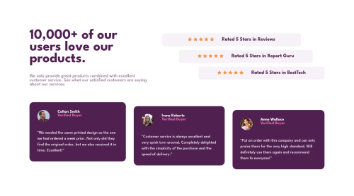
Social Proof Section using vanilla CSS and Flexbox.

Solution retrospective
I'm happy with my solution, but if anyone has any suggestions, I'm continually looking for ways to make my CSS more efficient and seamless between mobile and desktop. Thank you!
Please log in to post a comment
Log in with GitHubCommunity feedback
- @freakyjones
Hello Clewis,
congratulation on completing the challenge. I just saw your code, Here is my one suggestion that may help you in the future.
Use of universal operator to get rid of the default browser Style instead of using margin:0, padding:0 for every device
*{
  margin:0;
  padding:0;
 box-sizing:border-box
}
I hope it helps, Thanks Happy coding :)
Marked as helpful - @ErayBarslan
Hey there, nice work with this one! I see you've tried to center your content but you need an addition for it to work:
html { height: 100%; } body { ... min-height: 100%; }- You should move background-color and image from
.body-wrappertobodyelement. Right now background doesn't cover wide screens. Use the wrapper just to align your content. - Also if you use
max-widthon containers instead of a fixedwidth, your page becomes more responsive. - You have a good usage of media-query, but you might want to increase
min-widthvalue as content overflows on certain screens. These are my suggestions to improve your solution, happy coding :)
Marked as helpful - You should move background-color and image from
- @AdrianoEscarabote
Hello, how are you?
Congratulations on the result of your project, it really turned out very good. But try to pay more attention to how the project adapts to different resolutions, both higher and lower.
On my monitor the project was a little broken, but I managed to solve it as follows:
body { min-height: 100vh; }I also removed the
background-colorfrom the body. To not look like the layout is broken.the rest is very good hope it helps... 👍
Marked as helpful


Join our Discord community
Join thousands of Frontend Mentor community members taking the challenges, sharing resources, helping each other, and chatting about all things front-end!
Join our Discord