


Bálint Korpai• 620
@kemenyfa-szu
Posted
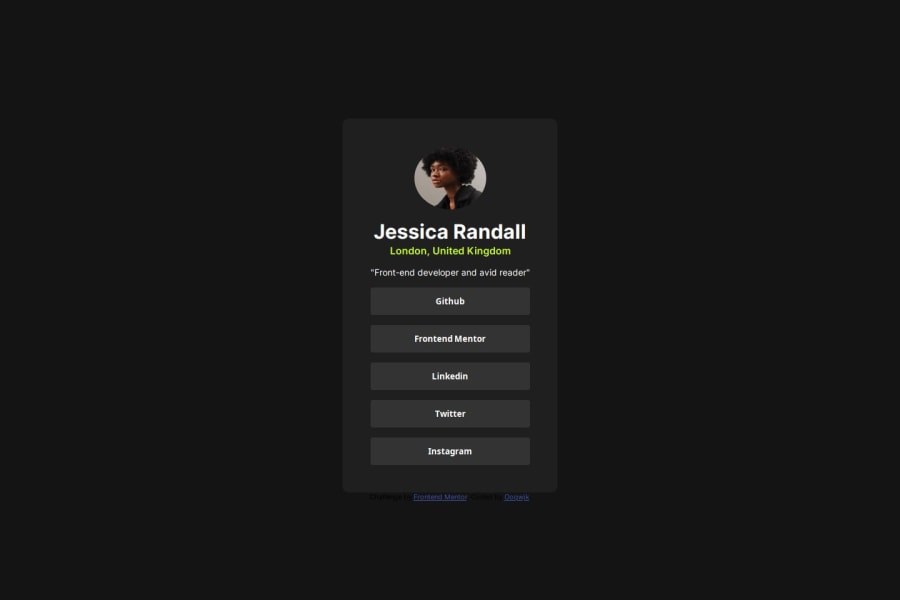
Hello @Oppqwjk!
Congratulations on completing this frontendmentor challenge! Well done!
- As the attribution section is not a vital part of the challenge, you can move it to the bottom of the screen with a position: fixed; bottom: 0; combo. However, the best workaround for these fits-in-screen-without-scrolling challenges, in my opinion is to set the component's container to min-height: 100vw; instead of setting it to the body element, so it will push down the attribution section to the bottom of the page by default.
- Also I recommend to you to use semantic markup elements for better accessibility, such as <main> <section> <article> and for social links <ul> and <li> <a> elements and also you can wrap the .attribution section into a <footer> element. Newby challenges do not require semantic markup, but it is best to use any possibility to practice them and their use. Semantic markup elements have the same functionality as divs but they have a structural and grammatical meaning for screen-reader programs.
- For social links I would use the above mentioned <ul><li><a> combo, as they are links. I only use buttons for form submitting or for actions that do change(s) to the current page's state and not redirect you to another page (such as "mark all as read" if we are speaking of notifications or messages).
- You have set the img width and height to px units. It is better to change them to their rem equivalents, so they grow with the font-size, when the user changes the browser's font size (CTRL+num.plus). This video helped me a lot to decide when to use which unit: video
Best wishes!
0
