
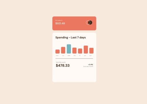
Code
Please log in to post a comment
Log in with GitHubCommunity feedback
- @shakhboz-shukhrat
Hello there👋! Congratulations on completing this challenge!
There seems to be no critical errors in the code. However, there are a few minor errors that can be fixed:
1.In line 3, "100svh" should be changed to "100vh".
2.In line 22, "display: flex" should be deleted as the "graph" class already has it.
3.In line 57, "align-items: self-end" should be changed to "align-self: flex-end".
4.In line 68, "padding" should be deleted as it is not needed.
Here is the corrected code:
body {
  display: flex;
  width: 100%;
  height: 100vh;
  justify-content: center;
  align-items: center;
  background-color: hsl(27, 66%, 92%);
}

.container {
  min-width: 430px;
  height: 70%;
}

.upper {
  width: 100%;
  height: 15%;
  background-color: hsl(10, 79%, 65%);
  border-radius: 17px;
  padding-top: 30px;
  display: flex;
}

.down {
  width: 100%;
  background-color: hsl(33, 100%, 98%);
  border-radius: 17px;
  height: 68%;
  margin-top: 22px;
}

.balance {
  font-size: 0.8rem;
  font-family: 'DM Sans', sans-serif;
  font-weight: 400;
  color: rgb(229, 229, 229);
  margin: 0;
  display: block;
  padding-left: 30px;
}

.pricee {
  font-size: 1.6rem;
  font-family: 'DM Sans', sans-serif;
  font-weight: 700;
  color: rgb(229, 229, 229);
  margin: 0;
  padding-top: 4px;
  padding-left: 30px;
}

.img1 {
  margin-left: auto;
  width: 60px;
  height: 60px;
  padding-right: 40px;
}

.graph {
  height: 130px;
  margin: 0;
  width: 100%;
  margin-left: 30px;
  display: flex;
  margin-top: 10px;
  gap: 14.3px;
}

.spendings {
  padding-left: 30px;
  padding-top: 30px;
  font-size: 1.7rem;
  color: hsl(25, 47%, 15%);
  font-family: 'DM Sans', sans-serif;
  font-weight: 700;
  margin: 0;
}

.days {
  display: flex;
  margin: 0;
  margin-left: 35px;
  width: 87%;
  gap: 36px;
}

.downp {
  padding-left: 34px;
  padding-top: 20px;
  margin: 0;
  display: flex;
}

.graphs {
  width: 41px;
  height: 100%;
  background-color: hsl(10, 79%, 65%);
  border-radius: 8px;
  align-self: end;
}

.dayss {
  font-size: 0.75rem;
  font-family: 'DM Sans', sans-serif;
  font-weight: 100;
  color: hsl(28, 10%, 53%);
}

.mon {
  height: 30%;
}

.tue {
  height: 50%;
}

.wed {
  height: 70%;
  background-color: hsl(186, 34%, 60%);
}

.thu {
  height: 45%;
}

.fri {
  height: 38%;
}

.sat {
  height: 60%;
}

.sun {
  height: 43%;
}

.prices {
  width: 115%;
  height: 25px;
  background-color: hsl(25, 47%, 15%);
  border-radius: 5px;
  color: white;
  font-size: 0.8rem;
  align-items: center;\n  justify-content: center;
  position: relative;
  bottom: 30px;
  right: 2px;
  visibility: hidden;
}

.up {
  margin: 0;
}

.downn {
  margin: 0;
  margin-left: auto;
  display: flex;
  flex-direction: column;
  align-items: flex-end;
  margin-right: 32px;
}

hr {
  width: 85%;
}

.total {
  margin: 0;
  font-family: 'DM Sans', sans-serif;
  font-weight: 100;
  color: hsl(28, 10%, 53%);
  font-size: 0.8rem;
}

.price {
  font-size: 2.2rem;
  color: hsl(25, 47%, 15%);
  margin: 0;
  font-family: 'DM Sans', sans-serif;
}

.per {
  font-weight: bold;
  color: hsl(25, 47%, 15%);
  margin: 0;
  padding: 0;
  font-family: 'DM Sans', sans-serif;
  margin-top: 20px;
}

.last {
  margin: 0;
  font-family: 'DM Sans', sans-serif;
  font-weight: 400;
  color: hsl(28, 10%, 53%);
  font-size: 0.8rem;
}
Anyway, your solution is great. Hope you will find this helpful. Happy coding!
Marked as helpful

Join our Discord community
Join thousands of Frontend Mentor community members taking the challenges, sharing resources, helping each other, and chatting about all things front-end!
Join our Discord