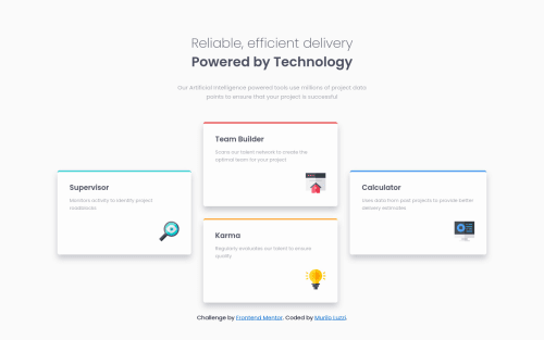
Submitted about 4 years agoA solution to the Four card feature section challenge
Solution made with Flexbox and mobile first

@mlzzi
Solution retrospective
I finished this one and it was quite a challenge.
I used flexbox, but in desktop view I don't think is the more elegant solution. I tried grid also, but no success.
If anybody can get me a hint I would appreciate it. Or any feedback on whatever improvements I could make.
Best regards!
Code
Loading...
Please log in to post a comment
Log in with GitHubCommunity feedback
No feedback yet. Be the first to give feedback on murilo's solution.
Join our Discord community
Join thousands of Frontend Mentor community members taking the challenges, sharing resources, helping each other, and chatting about all things front-end!
Join our Discord