Solution Newsletter sign-up form with success message

Please log in to post a comment
Log in with GitHubCommunity feedback
- @herojk64
good designing but bad structure for the form. first your tailwind configuration your loading though the CDN which is optional but learn to use node js and how to make your JavaScript more modular. Second you are listening to button click which is basically not ideal because the form is still submittable. what you want to do is include button inside the form and make the button type of submit and when you use JavaScript you listen to that form submit. advantages are you can get the values that are submitted through it without using any extra id for the input cause you only have one right now but in future if you have to work with many forms its a bad example. and instead of using two img with different screen break classes use picture will also default control that but its optional. happy coding.
Marked as helpful - @eduardoramirezrojas
Hi! I really liked your solution! However, I noticed a few areas where some adjustments could enhance the overall quality:
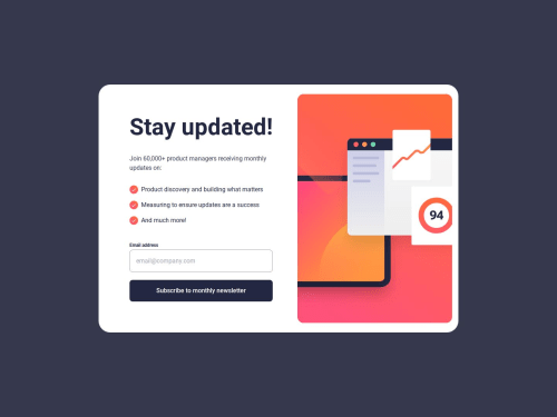
Image Centering: The
assets/images/illustration-sign-up-mobile.svgimage is not centered on mobile devices. This affects the layout and user experience, so centering it would provide a more polished look.Use of
<picture>Element: Instead of duplicating the<img>tag for responsive images, consider using the<picture>tag. This method is more efficient and can improve loading times. You can find more information about it here.Email Input Type: I noticed that you’re using a text input for the email field. Switching it to
<input type="email">would not only enhance form validation and improve accessibility but also allow the browser to autocomplete the user's email address, making it easier for them to fill out the form.Red Background: If the user enters an invalid email, consider using a
setTimeoutto make the red background disappear after a short period. This way, the user is alerted to the error without being distracted for too long.I’ve also created a similar solution, and I would love for you to take a look at my code and provide feedback. Overall, great work! With these adjustments, your project will be even more polished.
Marked as helpful - @sksksk2024
I also have a suggestion to improve your website, @xStephx! 📈🚀
If you haven’t explored accessibility yet, it’s really important to make your site accessible for people with disabilities, such as visually impaired(👨🏼🦯) or hearing-impaired(🧏) individuals. Using
altattributes for images andaria-labelsfor interactive elements can make your site easier for everyone to navigate and understand. It’s a great way to broaden your audience and make the user experience inclusive!To check your site’s accessibility, try the WAVE extension (available for Firefox, Chrome, etc.). It’ll show you where improvements can be made. Feel free to reach out if you have any questions or need guidance! 😎👌🔥
Thanks for supporting my work!🤩 And just out of curiosity—how do you get so many likes and appreciation on each challenge? 💀
Marked as helpful - @hannibal1631
Hey, once again you nailed it with this one.
Just one small suggestion, use setTimeout on the submit and reset button. Because when the submit and reset button are clicked, they work suddenly which looks choppy, so a small delay would looks good.
Other than that, it's alright! alright! alright!
Marked as helpful - @MohamedSharqawi
Very good, I learned a lot from your JS code
- @MuhammadZariyanAsif123
It's good but there are responsiveness issues in the layout.
- @mudasirNadeem
good very good
- @ariel172
You're too strong
- @collins-ai
This is nice, it looks great 👌. Your html and js code are very well structured and readable. I believe tailwind made your styling much more easy. I did the same challenge but my approach to solving it was different tho, you can check it out to see if I need any corrections if you like. Finally, I noticed that the subscribe button sticks to the bottom of the page on mobile device, is that ok?


Join our Discord community
Join thousands of Frontend Mentor community members taking the challenges, sharing resources, helping each other, and chatting about all things front-end!
Join our Discord