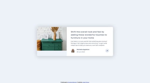
Solution to the article preview component, using SCSS and vanilla JS

Please log in to post a comment
Log in with GitHubCommunity feedback
- @jgengo-alt
Hello there 👋
First of all, great job 🚀 I really like your addition of the small border on the share button, it gives the vibe of being button compared to the very flat one the preview design. Also, your grid is nite!
However, I noticed a small issue with your solution: your social media buttons are clickable even if not displayed, you should use a
display: none;and toggle it instead of anopacity: 0;More a UX than UI feedback, but
- in mobile version, the translation of the share from the bottom to the top would be better than the left to the right 🪴
- in desktop version, I feel like the button share could toggle instead of having the hover effect: when tooltip display button dark, when not light. 🌱
Once again, great job!
Keep going 💪
Don't hesitate to follow me on and give me feedback on my assignments! I will follow back and keep giving you feedback if you are interested for your future publications.
Marked as helpful
Join our Discord community
Join thousands of Frontend Mentor community members taking the challenges, sharing resources, helping each other, and chatting about all things front-end!
Join our Discord