Not Found
Not Found
Not Found
Not Found
Not Found
Not Found
Not Found
Not Found
Not Found
Not Found
Not Found
Not Found
Not Found
Not Found
Not Found
Not Found
Not Found
Not Found
Not Found
Not Found

Submitted

Solution using HTML and CSS

Carlos Perezβ€’ 150

@perezc52

Desktop design screenshot for the Results summary component coding challenge

This is a solution for...

  • HTML
  • CSS
1newbie
View challenge

Design comparison


SolutionDesign

Solution retrospective


  1. What did you find difficult while building the project?

getting the two sides to line up. i had an issue where the right side grew bigger than the left and it was causing layout issues.

  1. Which areas of your code are you unsure of?

i am still unsure about the layout. i think it probably could have been structured better.

  1. Do you have any questions about best practices?

i'd like to know better practices for creating layouts like this. and just any feedback in general.

Community feedback

P
gfunk77β€’ 1,110

@gfunk77

Posted

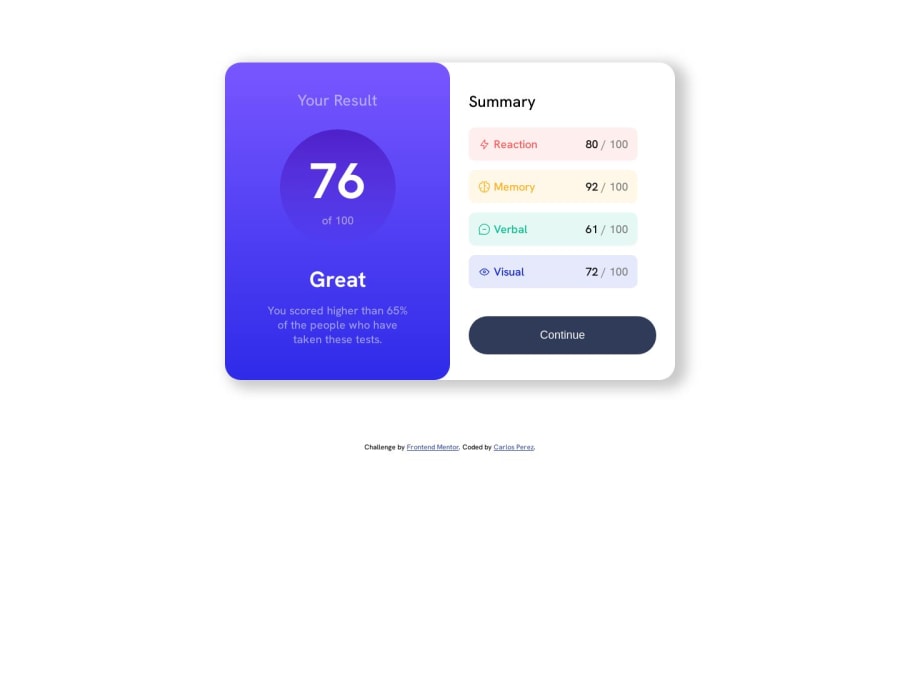
Great job on your solution! I'd suggest maybe trying the following to see if it helps you think about layout:

  • You have a card with two sides, left and right. So maybe start your layout with
<main>
 <div class="card">
   <section class="container left"> </section>
   <section class="container right"></section>
 </div>
</main>

Then add your .results in the first section and your .summary in the second section This basically creates a wrapper around the two sections you already have: results and summary, and defines the card.

  • align-items: stretch is a default value so you don't need to write that.

I hope the layout suggestions. Your solutions looks great. Congratulations on the challenge.

Marked as helpful

1
P
ApplePieGiraffeβ€’ 30,545

@ApplePieGiraffe

Posted

Hello, Carlos Perez! πŸ‘‹

Nice effort on this challenge! πŸ‘

I'd like to suggest taking another look at the responsiveness of your site, especially around ~1060px where things seem to look a bit broken as the screen width decreases. Remember that even if the desktop and/or mobile views of your site look good, it is important to make sure that your site looks great across all screen sizes so that as many people as possible can enjoy your work. If you’d like to learn more about building responsive layouts, check out this helpful course

Also I wouldn't make the "76" the main heading for this page/component because it isn't very descriptive by itself and doesn't identify the main content or information on the page. A simple span should do instead πŸ™‚

When deciding which elements to make headings, try to choose elements that describe the content below or around them, rather than elements which just look like headings in the design. Here's a great article that may help you learn more about making semtantic, accessible headings

Keep coding (and happy coding, too)! 😁

Marked as helpful

1

Please log in to post a comment

Log in with GitHub
Discord logo

Join our Discord community

Join thousands of Frontend Mentor community members taking the challenges, sharing resources, helping each other, and chatting about all things front-end!

Join our Discord