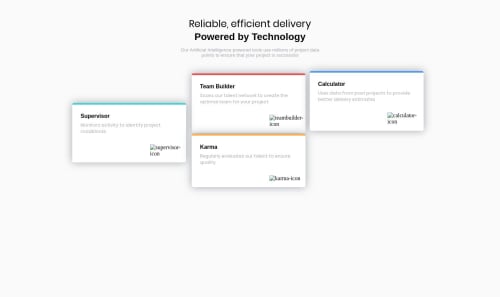
solutionZMZ

Solution retrospective
Hi everyone! I worked on atom and the final code looked just fine. But now the last box is not where it should be. I know, my code seems a bit long and messy, so I want your tips.
Please log in to post a comment
Log in with GitHubCommunity feedback
- P@nityagulati
Hi Madi, nice work. The site looks good on desktop and all the cards are where they should be. Some pointers to further refine the code --
-
The card icons are not showing. You will have to update the
srcpath for the images. -
Here's what you can do to cut down on the code repetition. You can add a separate class such as
cardto all the cards and add all the common attributes under that and keep the unique styling under the individual card classes such askarmaetc.
<div class="card karma">.card {...}.karma {...}-
Have you looked into CSS Flex/Gridbox? If not, I would suggest giving that a try. It's very easy and convenient to use to create such layouts without having to use
position. This also helps with making the site responsive, instead of adding positions for each breakpoint. -
The next step would be to look into media queries to make it mobile-friendly. Also, you can look into the mobile-first approach as Ndoy3m4n suggested. You can code for the mobile breakpoint and then use
min-widthto scale it up. This helps cut down on the code and also has performance gains when loading the site on mobile.
Keep up the good work!
-
- @madizhaksylyk
Hi, thanks for your feedback. I thought there is nothing in my code that is "nice". You gave me a hope) Please, don't hesitate to give feedback on my challenges, I appreciate it!
- @NDOY3M4N
Hi, nice approach with the positioning but there is a lot of repetition in your CSS. Also it seems like you forgot the mobile approach. You could start with the mobile approach and then adapt your code for the desktop view.


Join our Discord community
Join thousands of Frontend Mentor community members taking the challenges, sharing resources, helping each other, and chatting about all things front-end!
Join our Discord