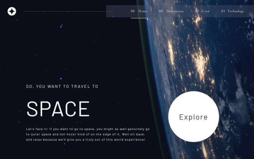
Space Tourism Website

Solution retrospective
I'm proud of how I structured the layout using containers to align elements side-by-side, just like the Moon image on the left and the text content on the right. It made the layout feel clean, organized, and scalable. Using a parent container as a flex container and wrapping the image and content in their own divs made the styling process much easier.
If I were to do it differently next time, I’d plan my containers and class naming more clearly from the start. Early on, I ran into issues because I was styling individual elements without wrapping them properly in containers, which caused alignment issues later on.
What challenges did you encounter, and how did you overcome them?The biggest challenge was aligning content side-by-side while keeping it responsive across devices. Initially, I tried positioning items directly instead of using containers, which broke the layout at smaller screen sizes.
I overcame this by:
Creating a parent flex container to control the horizontal layout.
Wrapping the image and text content in their own containers.
Using media queries to stack the layout on smaller screens.
Using flex-direction: column-reverse at one point, then switching to better container ordering using order in flexbox.
What specific areas of your project would you like help with?How to best handle responsive layout shifts — especially when switching from row to column without breaking alignment or causing spacing issues.
Suggestions for better class naming conventions and structure — especially for complex nested containers.
Any tips for making images scale naturally inside flex containers without overflowing or becoming distorted.
How to manage layout logic cleanly in CSS vs. JavaScript — I sometimes used JS to switch layouts based on screen size. Should that be avoided?
Please log in to post a comment
Log in with GitHubCommunity feedback
No feedback yet. Be the first to give feedback on Bunchydo's solution.
Join our Discord community
Join thousands of Frontend Mentor community members taking the challenges, sharing resources, helping each other, and chatting about all things front-end!
Join our Discord